Stringjoy Logo

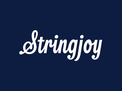

NEW WORK: Earlier this year I helped Secret Creative with a new handlettered logo for their rebrand of Stringjoy Strings.
The goal was to create an own-able wordmark with a bit of a vintage feeling. We also landed on this stylized ‘S’ that mimics the shape of a music treble clef. As seen in the attachment, the ‘S’ can also be separated out for used as a social icon or design element.