Test Drive – Gimlet Sans


David Jonathan Ross released Gimlet Sans on Friday, and I’ve been playing with it ever since.
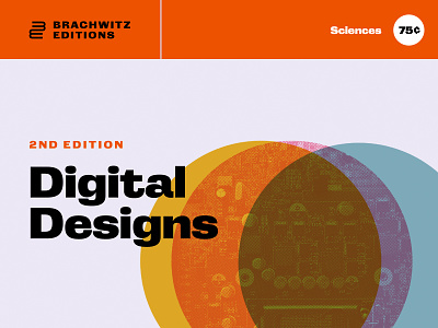
I really like the way it’s a solid workhorse font with a touch of quirk: serious, almost industrial, with a slight retro cartoonishness to it if you look close. It could work as a corporate letterhead, but the details of some of the letters—the way the ends of the C’s don’t line up, the slightly exaggerated nature of the lowercase r and t—would make it suitable for less serious usage as well.
Process: I thought about all the things I’d want to use it on and then I went ahead and made them.
(If you're wondering about the Orbis Lines text on the luggage tags, there is not, presently, an italic version—I was cheating 😎.)