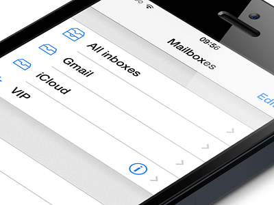
iOS 7 Mail.app redesign

Actual pixels: http://cl.ly/image/1T0u3v0j030b
Full view: http://cl.ly/image/0S2k3A3Q3020
The new iOS 7 interface makes things harder to read for me, mostly because of the use of Helvetica Neue Light. I made a redesign that I feel is better for readability.
Also did I move around some icons, redesigned the iCloud icon and made 2px lines instead of 1px lines.