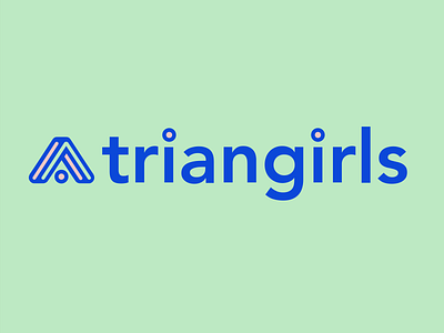
Triangirls branding
Triangirls began life as a channel in a Slack group, so it made sense that our first logo was a hack of an emoji. But as our community grew, we knew we needed a more serious look.
As part of our rebranding process we spoke to our community about our name. We weren’t sure if it was too silly, too feminine, or too abstract. But the feedback was overwhelming: people really liked the name, so that bit was easy!
Next up, the logo. After creating a shared Pinterest board of ideas, we had a pretty good idea of the style and colour palette and were keen to include the upwards facing triangle as it looks like an upwards pointing arrow, and we’re all about lifting each other up.
I first began looking at triangle glyphs. And ‘protect’ really stood out.
It works on so many levels. During our events, we all feel protected and like we’re in a safe space. And then the dot inside the shape reminded me of the speaker, and the shape the audience.
Adding a bit more visual treatment to the shapes made it really feel like a ‘logo’.
We’re really happy with the final result and have had such amazing feedback from you all.

