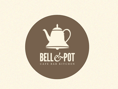
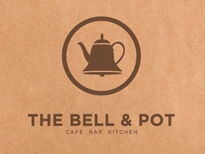
Bell & Pot Second draft
Second draft of this logo. It was requested that the logo mark and text be more unified so as to be used as a sticker for coffee cups and take away packaging as well as in a sign outside. The client didn't want the mark and type to ever be apart. Fair enough.
More by Eric Greene View profile
Like


