Top 2019


For about a decade, I've kept up with what music I'm listening to throughout the year and often have made a top 10 list of my favorite albums released that year. In the past, that's been through writing blogs about them or posting creative stuff on Instagram about the list.
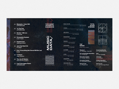
At the beginning of 2020, I decided to do something a little different and to list out what I actually listened to (non-release year specific) rather than try to pick albums released only in 2019. I also tried to use visualizing that data as a bit of a design warmup exercise at the top of the year and this is what I landed on. I had been wanting an opportunity to design some little random pieces/icons that were mostly for aesthetic and not "actual" info-driven icons, and this provided that.
The result is a combination of a lot of my design sensibilities — background layer image compositing/blending, major focus on type (was super into these fonts while working on this — Eurostile is so cool), minimalist icons, and texture. I tinkered with this piece for a long time between other projects and I love it still. I got to riff on 80s, 90s, and modern vibes with it. The style of this has bled in little ways into things I've been doing for church and client work since. It's so cool how inspiration like that works!