Saint Kate — Brand Marks System


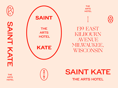
The Saint Kate identity balances two functions simultaneously: it’s a supportive visual framework for artistic expression, as well as a vibrant and memorable voice for the hotel itself. The oval of the mark—a formal nod to printer seals, crests, and vignettes of the past—represents a frame or a lens: a window leading to a new perspective; a portal to an unexpected experience.
See the full case study here (https://onedesigncompany.com/news/featured-project-saint-kate).