36 Days of Type 4


'4' for 36 DoT
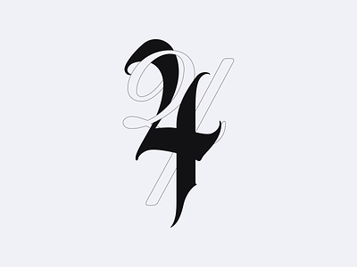
I'm exploring the relationship between blackletters inspired letterforms and other styles, mixing them to create a new shape. I noticed scripts were working quite nicely with the letters I'm creating. Mostly because they share similarities, with one main opposing trait: weight. Blackletters are often bold and rough/sharp, while scripts have a degree of fragility and softness, making the pair perfect for each other.
Agree or disagree? Let me know below!
Cheers