


Fat As Fuck, Keto Snacks

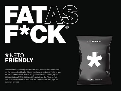


This is one very Bold, Clean, Modern, Minimal and Sophisticated concept for Keto Snack Brand. The idea behind this concept is embracing the name and the idea of differentiating on the market with the Swear Word and enhancing it trough out the Brand Messaging and Brand Visual Identity. The focus of the communication should be on the Fat aspect of the Brand but with some other Swear Words incorporated in those "Fat and Good Fat" messages. With incorporating other Swear Words I have used the * sign to hide them and with that idea in mind the * sign is the main Icon of the Brand. It is very simple and interesting in the same time. The style is very Typography based with very Bold and Big letters which are different in thickness and outlines. The concept has a very modern approach which suits the Target Audience. The Black and White Colors and Typography Layout gives the Brand a very Sophisticated and High Class look.