Terradiva - Restyling

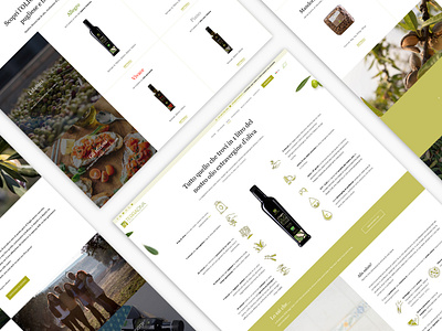
The website has been redesigned to reflect the existing Brand Identity.
The palette is characterized by shades of green that underline the company's link with nature and its commitment to organic agriculture and protection of the territory.
In some pages, there are olives and almonds that float on the background and paint stains that give material and natural appearance.
The contrast between serif and sans-serif fonts gives softness and makes the texts easily readable.
Full Case Study on Behance: https://www.behance.net/gallery/93109679/Terradiva-Organic-farm-in-Puglia