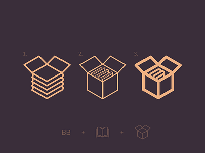
"BookzBox" App Logo - Book + Box
A friend of mine asked if I could make a logo for their project. They are working on an app that's going to be focused on trading books, and the name of the project is "BookzBox".
Immediately after hearing the name I thought of something resembling a box of books. I researched what similar services' logos looked like, got very inspired by the famous "Dropbox" logo, and looked through a ton of other book and box logos, icons and symbols.
I started brainstorming and sketched some examples in Adobe Draw on my iPad. I settled immediately on the fact that this has to be a simple line-logo, since I believe that shows the books and the box in the simplest and least confusing way. The first idea was just a simple box with 3 books in it, I also thought it might be cool to have one B on each side of the box, representing the name of the app, but after further assessment that seemed a bit too messy. Second idea had a little twist to it, the box itself was made out of a stack of books.
So I went ahead and started illustrating the ideas in Illustrator. The third idea kinda came out of nowhere when I realised the fact that "oh, this is an app, and an app symbol is going to be small on a phone screen, the stroke should probably be thicker 😅". The books inside are also smaller, that helps with separating them from the thick edges, therefore only 2 books could fit, which worked well with simulating a letter "B".
I tried to keep the stroke thickness tailored to each specific idea, and followed the color palette that the project group provided me with. They seem quite happy with all 3 ideas, but I'm still curious if you guys have anything that I could potentially change? Which idea is your favourite? Have I forgotten something? All constructive feedback is highly appreciated! 💚

