Brand Identity Redesign for eLife 🧬

Brand Identity Redesign for eLife 🧬
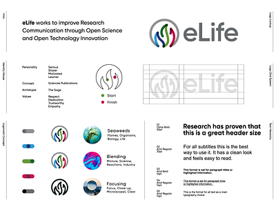
eLife is a non-profit organization created by funders and led by researchers. Their mission is to accelerate discovery by operating a platform for research communication that encourages and recognizes the most responsible behaviors.
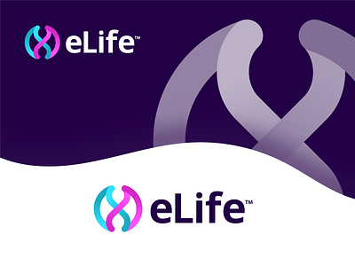
Another concept that went unused. Big fan of the look and feel of this direction.
I used below elements to make the symbol more meaningful and unique:
- DNA String
- Leaves for Life
- Infinity Loop
See the final logo on their website:
https://elifesciences.org
Interested in working with me?
I'm open for new freelance challenges: