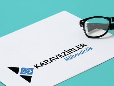
Karavezirler branding 2019
The corporate identity of this brand was developed from the main element of the logo - capital H which turns into a female screw. Was created a company pattern with the same symbol. Three corporative templates of a blank were prepared as well as business cards, company letterhead, folder and envelope.
Design — Adobe Indesign
Illustration — Adobe Illustrator
Check out for more on Behance & Instagram
------------------
Don't forget to ❤️ Press “L” to support the shot and Follow me for more!
------------------
💌 I am open to new projects! design@katerinabot.com
branding
businesscard
creative
design
illustration
layout
logo
logodesign
pattern
pattern design
typography
vector
View all tags
Posted on
Mar 18, 2020
More by Katerina Bot View profile
Like


