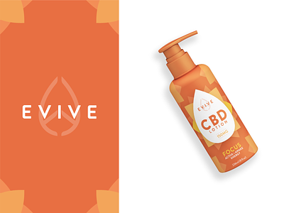
Evive Focus CBD Lotion Package Design

Next project of my new portfolio is the Evive CBD project I made at Lucid-Design.
This was a brand identity and packaging project. Evive came to us wanting a clean, fun brand that everyone could appreciate and enjoy.
The mark is a combination of a droplet, a CBD oil reference, and two capital letter E’s, one forwards, one backwards. The E’s are the first and last letter of the name Evive. Between these two E's and inside the brand itself, there is a whole world of CBD goodness for all to enjoy.
We landed on the balanced paring of focus and relax because we felt an experience-based product was more relatable and versatile.
The goal with Evive’s Focus CBD lotion was to radiate the feeling of focus, with a bright citrus scheme and sun flower like graphic, this bottle informs the experience before a word is read.