Spotify Redesign

I decided to redesign one of the Spotify's screen after coming across an article that described some of the issues faced by users using Spotify.
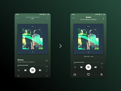
I changed the placement of the heart icon as tapping the icon changes the location of the playing dot very often. Icon is somewhat bigger than what it is now so that people having larger thumbs can tap the icon easily.