Prismatic App Interview - Take Home Problem
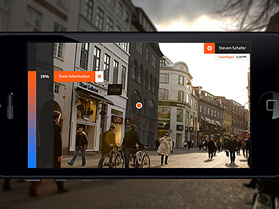
A few months ago I interviewed at Prismatic the app (fucking awesome app by the way) up in San Francisco - I loved the company and the interview but I was just not ready to make a move to the Bay Area at the time. However - I got a really cool design piece out of it that I had a blast making. This shot is the first of three. Below is the description.
Here is the problem:
The year is 2015 and Prismatic has grown into an entertainment powerhouse. We dominate worldwide discovery for news, local events, apps, games, TV, and movies. Our next area is local discovery with a focus on phone-sized devices, starting with iPhone.
We do some user research and decide that the most natural way to go after local discovery is with a new stand-alone product taking an augmented reality approach: point your phone somewhere, and we overlay the world with context and actions.
“In Person” Research:
After receiving the problem and taking a day to fully digest the nature of it, I walked around town to major retail centers and urban environments and imagined how an AR app would benefit me from a discovery standpoint.
Scene Selection:
Copenhagen, Denmark
I chose a foreign country for the scene. During my travels, I have always thought of all of the interesting spots and things to do that are unknown to the average tourist. I feel that a Prismatic AR application would solve this problem and provide a fun way to discover things in foreign countries.
Interest Bar:
The highlight of my design is the interest bar and interest point. The interest point is a “crosshair” of sorts that is fixed in one position in the center of the screen. The user would move their phone around hovering around in the environment until the interest bar to the left would read an interest level up to their standards. For example, if I pointed my phone directly at a cool art gallery that had art inside which would interest me, the interest bar would be a red / warm color and would read generally over 75%. If I pointed my phone at a furniture store that carried mainly victorian style furniture, the bar would read around 5% and would be a cool blue color giving me a visual indication that I would generally be uninterested in discovering that specific store.


