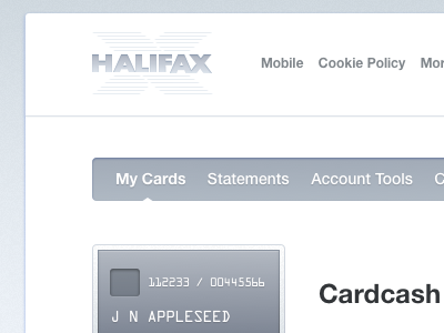
Halifax


Banking sites suck.
I decided today to redesign my provider's(Halifax) site, and create a simpler, cleaner experience.
I wanted quick access to my statements, sending money and a smarter layout for digesting content. Also, less damn sidebar.
I'm still feeling a lot of areas for improvement(ie card illustrations), and rethinking the search bar. Any feedback is welcome. Overall, I'm really enjoying how it came out.
Side note: I'm joining 6Wunderkinder in July! Interning with the product design team for six months. So, in preparation, I'm taking on a lot of freelance work up until then - so get at me if you need some work done:)