


The Bald Journey

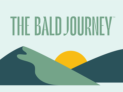
Part of branding Mantl required a wordmark for Mantl's journal, The Bald Journey. They needed a logo that could work in unison with Mantl's primary logotype while being different enough in its own right.
We landed on this wordmark, which echos elements of Mantl's logo (like the apex of the "A"), while still providing enough contrast with the existing brand.
To accompany The Bald Journey logo, I designed a series of illustrations to give a visual representation of "journey". In the background, Mantl's dome logo acts as a rising sun, representing acceptance at the end of the journey.