


Laguna Wordmark

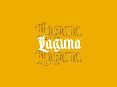
I did this lettering piece a few months ago as a test for a wordmark I was working on. This piece was ultimately rejected by the client, but I really love the design of the letter g and the rhythm in the letterforms. Lowercase g's are really the best character to get experimental, and weird!