


Pomodoro iPhone app icon

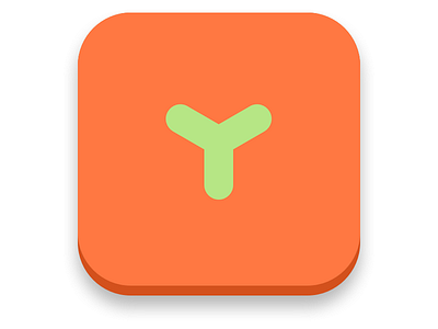
This is the icon I've come up with for a Pomodoro app I'm designing.
As it's a Pomodoro (http://www.pomodorotechnique.com) app, it's designed to look like a tomato, and the stem (?) is the 'Y' of YoPomodoro, the name of the app.
It's deliberately stripped back to reflect the simplicity of the concept. It also has a cartoony feel, which ties in with some of the fun social/game elements that the app will feature.
Comments welcome :)