


MobisleNotes iPad UI, second try

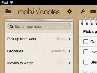
Ok here's a much more subtle design where I've also removed the rectangles around the button icons. It looks better but is it hard to understand?
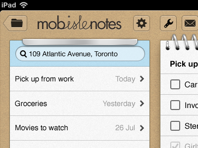
Ok here's a much more subtle design where I've also removed the rectangles around the button icons. It looks better but is it hard to understand?