personal rebrand update
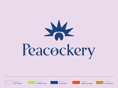
Here is another logo update. The last concept was weak because I was holding onto the "P" from my previous logo. This mark represents both the form of a peacock as a whole and the tip of a feather much more strongly and simply. I feel like i've landed.
More by Michael Peacock View profile
Like

