Can Design

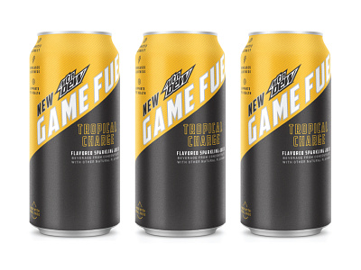

Almost 2 years ago I had the opportunity to work on some concepts for the new Game Fuel can design with Motive. Both of these were "almost" approved before there was a shift in the scope of the project. The objective was to design around a new tactile texture that the cans would have - hence the matte finish and grip tape-like texture. I offset that gritty tactile texture with pops of metallic from the can in the name. It needed to be clean, modern, uncomplicated, and appeal to the sophisticated gamer demographic.
Fun project to be a part of and these will just rest in my archives.