


Spareto: Online Car Spare Parts Delivery Company Logo Design

New logo project for an online car spare parts delivery company in the US.
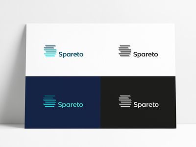
This styling of the initial S is a connection to 'parts' with the idea of stacking/storing/shelving of these spare parts, the 3 pairs of horizontal bars also have a subtle hint towards road lanes/markings connecting to delivery/driving etc, all in one stylistic mark that isn’t at all cliche or stereotypical for it’s sector :)
The top half have a slight forward reach, compared to the bottom half, so it looks slightly forward leaning, so add's a touch of movement, without it being overly slanted/sheared etc.