Neumorphism/Soft UI - Making It Accessible

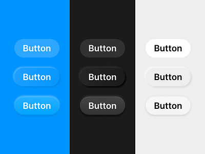
(top: standard, middle: current trend, bottom: my revisions)
The neumorphism design trend has made its way across Dribbble recently - despite its common criticisms of poor contrast and accessibility, I believe that a more "tactile" UI is a great idea that may actually increase usability, if done correctly.
This is my proposal for revising the neumorphism/soft UI style. Here are the most important changes I've made:
1. Lighten color compared to background to add contrast - this especially helps in dark color styles
2. Add second bevel effect on the inside of the button, allowing the lighter button color to still blend in smoothly with the background
3. The virtual light source has been relocated to the top, as light coming from the top-left doesn't make sense in most lighting conditions devices are used in
4. The top white outer bezel in light mode is removed and replaced with a less intense black, as it blurs the transition from the top of the button to the background too much
I believe that these changes go a long way in making neumorphism more suitable for production apps, increasing contrast to be on par with standard buttons or better. Any feedback is appreciated!