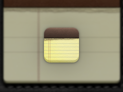
Safari App Icon


This is the sort of direction (har har) i'd like to see the iOS Safari icon move towards. Again, like many of the stock apps, the icon is really outdated.
Like my others so far (see rebound chain) I try to stay loyal to the original icon (in terms of pallets, elements, etc) while at the same time re-creating the features from the ground up with a more modern/higher fidelity take (aka retina-only age).
PS. Compass shape inspired by @Nik!