WIP - Brandmark v4

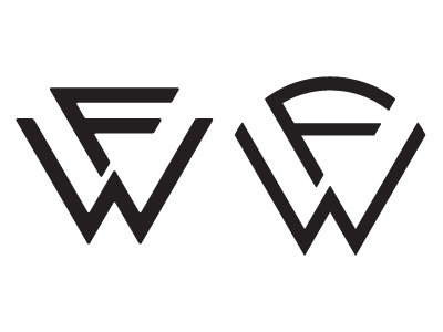
Take a look at the animated GIF...some followup revisions to the WF mark. The two issues with the previous mark:
1. Client said it seems too harsh and rigid
2. Client said a lot of people read it as FW instead of WF
I softened the edges as much as I could without compromising the structure. Also adjusted the W slightly so that it looks more prominent, as the logo will be black or white, and there will be no color to emphasize hierarchy.
Also, added a secondary element to the mark, so hopefully now it's clear what the company is, even sans lettermark.
Thanks for everyone's feedback during the previous round!