


Discogs revamped! 💿📚

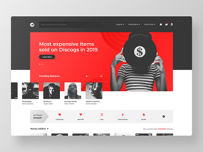
A little revamp of Discogs (music records database) website, trying to modernize it with a clean and modern look.
Liked the result of the little logo mark too. The vinyl with the player needle, creating that negative space letter "d" as well as the gradient giving that movement feeling.