Web Site Data Graph

I've been playing around and came up with this idea.
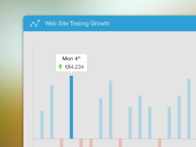
It would be really cool if you could see on a day by day basis how much extra revenue you have gained (or lost) from your A/B tests.
This is just playing around and it needs a lot more work, but I thought it was a cool way to visualise the data.
Feedback and thoughts all welcome :)