Original Coffee - Packaging

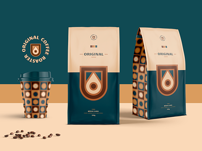
The basic concepts for creating the visual identity were traditionality and elegance. The colors chosen refer to both coffee and a rustic environment. Dark blue contrasts with beige in a very harmonic way, emphasizing shades of brown. The symbol was built from the golden circles, adding even more to the aesthetics of the project. A drop of coffee, the letter "o" and a coat of arms form a strong and memorable symbol.