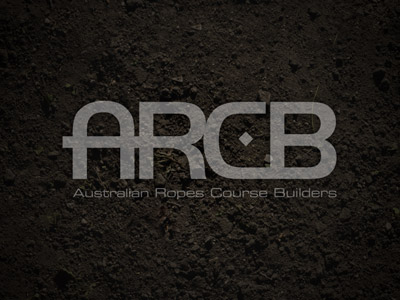
Here's a logo I designed for good friends of mine - Rob & Sid. I wanted to create a clean "extreme sport" feel, have the letters "ARCB" be continuous like a length of rope and have the square in the middle of the "C" act like a bolt ...
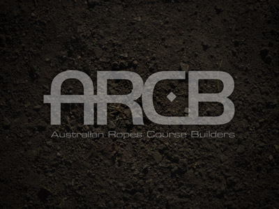
During the recent revamp of my website my existing logo looked out of place so I decided to design this new one during the process to try and keep with the new direction.
Font: Semilla
Texture: view
Larger view: view