Learn what makes a great icon set and how to find the best UI icon set for your projects. Get a list of popular icon sets to download and use right away.
Icons have been used for hundreds of years to communicate. They’re on road signs, maps, and anywhere words aren’t fast enough. The use of icons has become especially important in the digital age, and there aren’t many websites, apps, or software out there that don’t use at least a few icons. Keep reading to learn more about iconography, icon sets, and where to find the best icons to stay up to date in the world of UI.
What Is an Icon Set?
An icon set is a group of icons designed to work together in a project to create visual unity. An icon set can be thought of like a font. Using too many font styles in a project is disorienting. Similarly, using poorly matched icons makes an interface hard to understand. Commonly used in UI design, icon sets make an interface more harmonious and easier to use in the same way font families make a design more readable.
Icon sets make an interface more harmonious and easier to use.
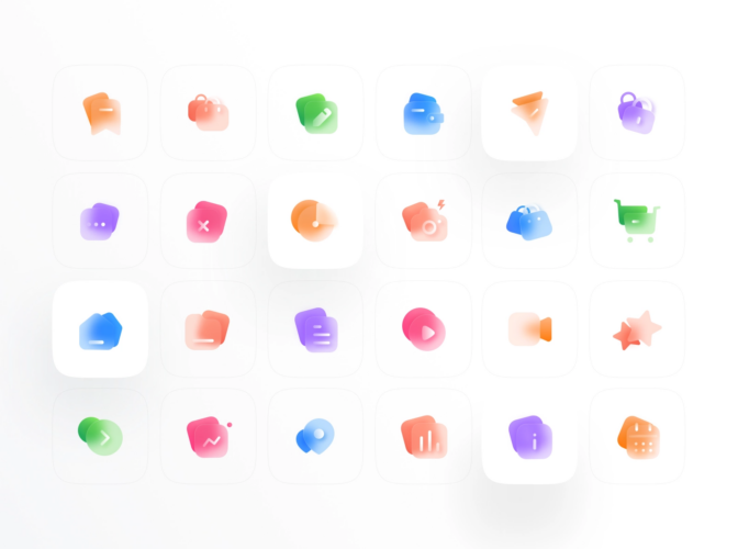
Like fonts, ready-made icon sets can be downloaded and used in your project. Icon sets do differ from typefaces in one key point. When you purchase a typeface, you’re certain it comes with the full alphabet in lowercase and capitals, numbers, and commonly used glyphs. Icon sets vary, and you have to check what icons you’re getting before you make a purchase.
![]()
What should an icon set include?
There’s no objective list of icons a set needs to have. Two sets might have completely different icons. The important thing is finding a set with everything you need for your project. To make sure you aren’t an icon short, you should make a list of all the icons you know you’ll need before choosing an icon set.
Identify all the icons you know you’ll need in a project before choosing an icon set.
That being said, unless you’re working on a limited scope project and need specialized icons, you probably want an icon set with a large range. You also want to see if the set has line or fill versions of the icons. Line icons, like this set of 100 icons, are made with outlines. Fill icons are solid flat icons. You also want to make sure you’re getting vector icons so you can use them at different sizes.
Sometimes you need specialized icons. For example, consider this weather icon set. It only has a few icons that serve a specific purpose. Another common limited icon set is the social media icon set, which includes a flat logo for each major social media platform. You can also get icon packs for specific programs like PowerPoint.
The basics of good icon set design
Not all icon sets are of the same quality. Using a poorly designed icon set diminishes the overall usability and aesthetic of your project. If you want to ensure you’re using or purchasing a good icon library, you need to understand the fundamentals of icon set design. Here are the main tenets and requirements of a quality icon set:
- Unity. The most important thing to look for in an icon set is unity. All the icons should look like they go together. The feeling of unity is intuitive, but if you’re unsure, there are a few specifics you can check off. Lines should all be the same weight, the edge style (rounded, fileted, or square) should match on every icon, and the color scheme must be the same throughout.
- Geometry. Icons should look clean geometrically. This means they’re based on perfect shapes like squares and circles. If they aren’t, they’ll look sloppy in use.
- Positive and negative space. Icons need to be easy to see at small sizes. If the positive space (the icon) isn’t properly balanced with the negative space (the blank area surrounding the icon), the design will coalesce at small sizes and become a blob. The best test to check for good space is to just zoom out and see if you can still make out the icon at a small size. You can also do the same thing by squinting your eyes.
- Good contrast. Contrast is the visual difference between design elements. Good contrast occurs when you can differentiate between the design elements easily and nothing blends together.
- Minimalism. Icons aren’t supposed to be full illustrations. They should only have enough detail to be recognized, otherwise they look cluttered and hard to see at small sizes.
- Consistent size and dominance. No icon should look more important or interesting than another in a set. They should all be the same size, have the same amount of detail, and have the same amount of color saturation.
There is never one design answer that’s perfect for every purpose, as seen in these Instagram logo redesigns.
![]()
Know your icon file formats
When you’re downloading or creating icon sets, it’s important to understand the common file formats used for icons. Here are some of the main file types:
- SVG. Scalable Vector Graphics, or SVGs, are one of the preferred file formats for icons because they aren’t resolution-dependent.
- PNG. PNGs are raster-based graphic files, which means they are an area of pixel information and are not scalable. For example, a setting icon formatted in PNG might look fine on mobile screens but look pixelated on a desktop device. PNGs should only be used if the icon doesn’t need to be scaled up.
- EPS. EPS files can save vector, bitmap, and text data. This format is commonly used for logos.
- PSD. PSDs are photoshop documents. You can open and edit them in Adobe Photoshop. Keep in mind, Photoshop is a raster program, which means icons won’t be scalable unless you convert them to vectors.
- CSS icons. Cascading Style Sheet, or CSS, is a file format and software language primarily used to manipulate the visual appearance of HTML websites. To use CSS icons, you will usually refer to an icon library.
Designing your first icon set? Start with these articles on the 3 do’s and don’ts of icon design and 10 iconography rules to follow in UI design.
![]()
Glossary Of UI Icons
A UI (or user interface) icon is a symbol used for computer interfaces and is usually a button or link. The home symbol, app buttons on mobile devices, and the minimize window button are all examples of UI icons. They’re pictograms just like Egyptian hieroglyphs. This ancient writing method has made a comeback in recent years because it’s both more accessible and can communicate complex ideas in a small space.
UI icons are also easier to recognize quickly than plain text is. Imagine if your desktop just had the name of each program without the icon — it would take forever to find what you’re looking for. There are lots of innovations with UI icons and some even come with animations.
There are five main types of icons:
- Arbitrary Icons. These icons don’t represent anything naturally and are abstract shapes users learn to associate with a specific action. The hamburger menu button is an arbitrary icon often seen in mobile interfaces. The three horizontal lines don’t relate to a real-world analogy, but everyone knows clicking it will open a drop-down menu.
- Resemblance Icons. Resemblance icons are the antithesis of arbitrary icons. They do relate to a real object or action. An envelope symbol to represent email is an example of a resemblance icon.
- Reference Icons. The middle ground between arbitrary and resemblance icons is held by reference icons. They show images of real-world objects but are metaphorical or analogous. For example, a compressed file might use a clamp symbol. Users understand compressing files is like squeezing a physical object, even though it has nothing to do with clamps. The gear icon or COG icon for settings is another example of a reference icon.
- Skeuomorphic Icons. Despite their complicated-sounding name, skeuomorphic icons are actually the easiest to understand. They directly represent and function like real-world objects. The desktop waste bin is a skeuomorphic icon. It looks like a real trash can, users can throw digital items into it like a real trash can, and you can even rummage through it to find discarded items later if necessary.
- Glyphs. Glyphs are a type of typographic symbol and have been around for much longer than computer icons. They include characters that aren’t letters or numbers, such as dollar signs, asterisks, and operation and math symbols. Glyphs make good UI icons because most people are already familiar with them. For example, the “+” glyph is used as a button for increasing the number of items you want to add to your cart.
![]()
Most Popular Icon Sets for Figma
Figma is a collaborative tool for interface designers that lets users work on team projects remotely. Many UI designers are starting to consider Figma an industry standard. Familiarizing yourself with popular icon sets for Figma can help you keep up with trends or break the mold. Here are some of the most popular icon sets for Figma you can download for your own design projects.
Download free icon sets for Figma and other Figma freebies on Dribbble.
Unicons by Iconscout
Unicons could be called the Helvetica of icon sets. The designs are simple and geometrically clean. They don’t have a definite mood or feel, which means the set is versatile and can be used for almost any project without clashing with other elements.
This set includes over 1500 icons spanning 27 categories, so it’s unlikely you won’t be able to find what you’re looking for. The icons include fill, line, and multitone monochrome versions. It includes all of the web icons you need for most projects.
![]()
Microsoft Fluent System Icons
Microsoft Fluent System Icons is an icon set design from Microsoft that has a friendly feel with rounded corners and simple shapes. It includes fill and line styles. It’s a minimalist icon pack that looks clean and uncluttered.
![]()
Doodle Icons
Doodle Icons by Khushmeen Sidhu is the perfect icon set for getting a fun, light feel without losing clarity and efficiency. The icons in this set have a hand-drawn style that looks like a whiteboard marker. Even with the loose style, the icons look clean and legible at a variety of sizes. The set only includes line-style icons, but the set has over 300 icons in 15 categories, including alphabet icons and business icons.
![]()
Explore Top Icon Sets For Your Projects
Creating a toolbox of the best icon sets will prepare you to find the best UI solutions. Check out and download some of these professional, industry-standard icon sets to use in your projects, enhance your designs, or inspire your own icon set designs.
Material UI Icons
Material is a UI design tool created by Google. It uses widgets and databases to help speed up development. Material UI icons refer to the five sets of icons available as Material libraries. This industry-standard icon set is completely open-source, which means you can download it for free to use in both personal and commercial projects.
![]()
Premium Vector Line Icons
Myicons’ Premium Vector Line Icons set comes with over 10,000+ line icons across 78 different categories. Plus, the icon pack gets updated every month with over 500 new icons! Icons are compatible with Adobe Illustrator, Adobe Photoshop, Sketch, and Figma.
![]()
Alpha Icons Collection
The award-winning Alpha Icons Collection by Anatolii Babii contains two versions of 144 semi-transparent vector icons each, specially designed for effortless use on any light or dark background. Since the icons are semi-transparent, you don’t need to apply blending modes to them when using them on backgrounds of different colors and saturation. At the same time, they are easy to recolor!
![]()
BeBold Essentials UI Icon Pack
The Essentials UI Icon Pack is a set of 222 bold and common UI icons built with a 14x14px grid. Perfect for dashboard designs, the icons in the set are compatible with Figma, Sketch, and Iconjar files, available in AI, EPS, PSD, SVG, Pdf, and PNG.
![]()
Universal Icon Set
The Universal Icon Set comes with 632 icons in three different styles—line, solid, and duotone. All icons in the set are vector-based with smooth and rounded corners and customizable colors. Thanks to product designer Dima Groshev for creating this useful icon pack!
![]()
Premium Social Media Icon Set
For simple and minimal social media icons, get the Premium Social Media Icon Set from Myicons. This vector line icon set comes with 100 social media icons compatible with any design software.
![]()
Where to find free icon packs
You don’t have to shell out to get good icon sets. There are tons of free icon packs available for download.
Dribbble is one of the best places to find thousands of free icons and icon sets. You can find clean, colorful, and stylish icon sets with fun themes, and you can find isometric 3D icon packs for iOS to stylize app and desktop icons. You can also find Windows 10 icon packs if you aren’t a Mac user.
It’s usually best practice to give attribution to icon creators when you use their designs, especially when they’re free. Check out this article for more ethical design tips.
Find the best icon sets for your designs
When used correctly, an icon set can improve user experience and provide additional visual appeal for your websites, mobile apps, and other digital products. When choosing an icon set for your design, remember to keep styles consistent, stick to universal symbols, and make sure every icon you use serves a purpose. Happy designing!


