


SpeakOut.org - Redesign
11 • 1
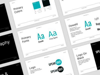
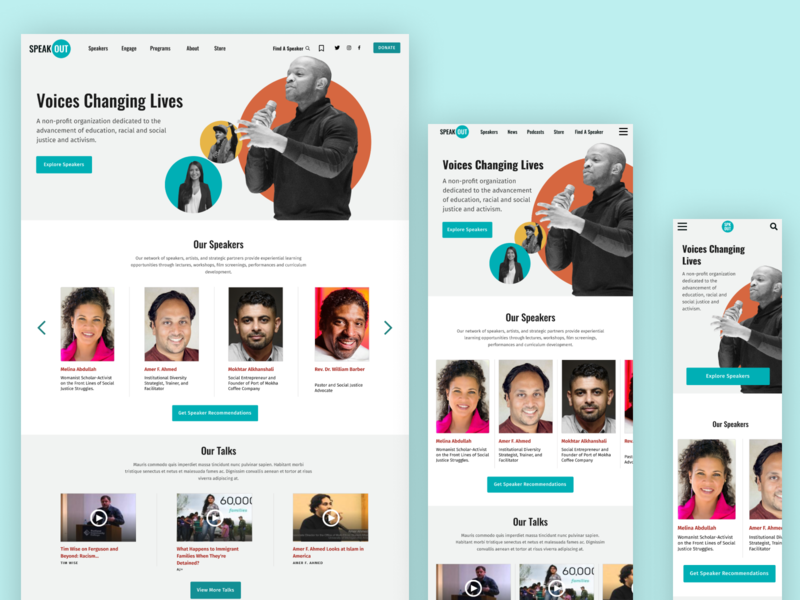
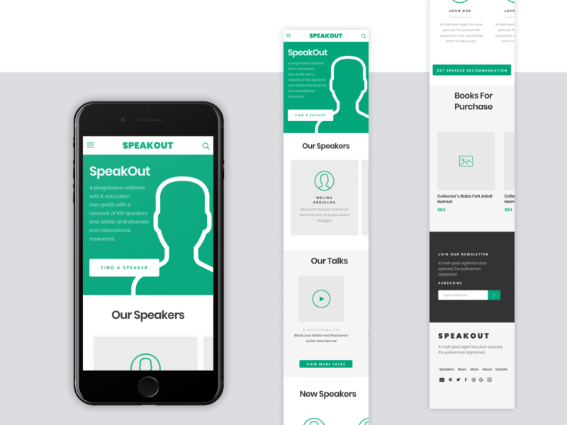
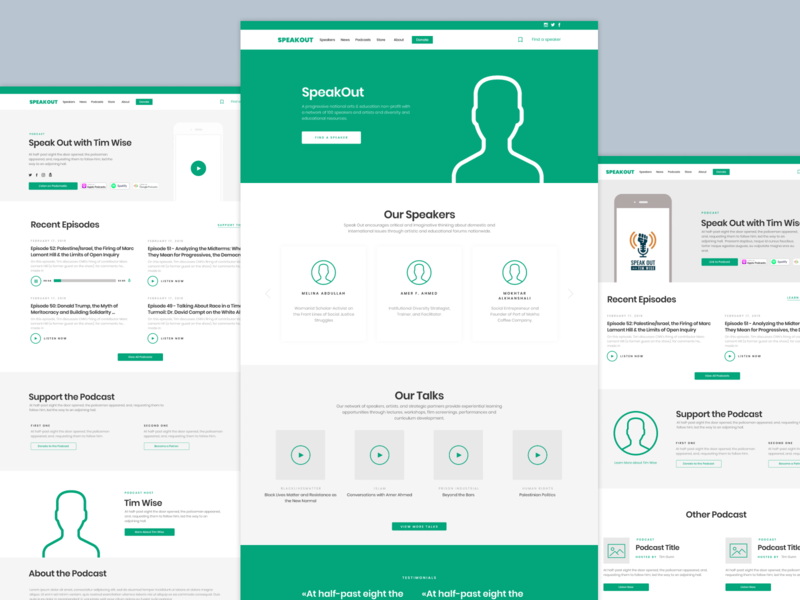
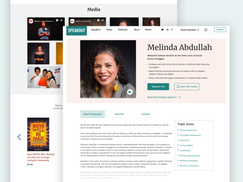
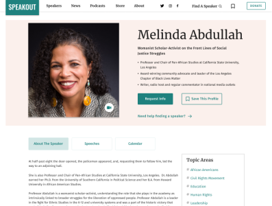
Documenting my steps in redesigning the Speakout.org website. From personas, wireframes and ui design. Follow share, do all that.
More Projects


11 • 1
Documenting my steps in redesigning the Speakout.org website. From personas, wireframes and ui design. Follow share, do all that.


