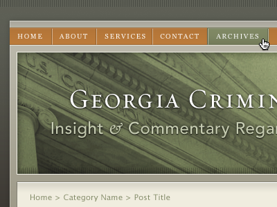
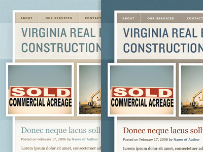
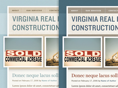
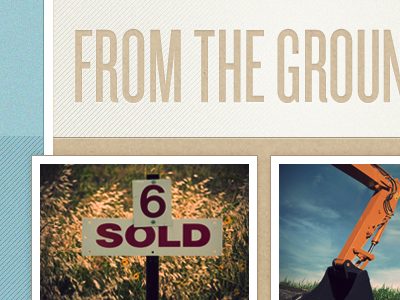
The mockup on the left was my first attempt, received feedback that the colors should be more "masculine." I'm not really sure what that means, so I made it darker and added red. Men out there: does this make you feel less threatened?
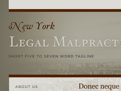
After hours of accidental tweaking and playing around, the design has evolved to this. Not sure which one fits the project better, but I think I like this one more.
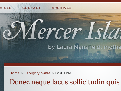
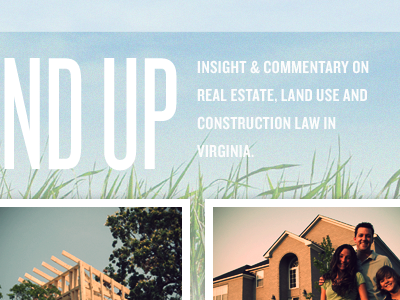
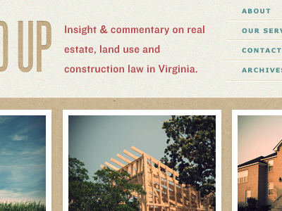
Working on another lawyer blog. This one requires more groan-worthy stock photos, but I'm trying a different approach with these. The photos are treated using the much loved Veerle Vintage Effect.