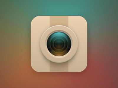
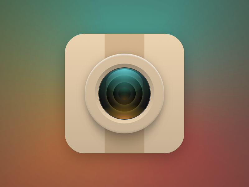
For Instagram I decided to make a variation of the Camera icon, like I did with the Messages/Messenger, to keep visual consistency. I added the vertical stripe to make the icon more distinguishable, and I like that, but the thing is, I'm...
Doing the gallery icon was actually easier and funnier than I initially thought! Well, yes, I had to try some iterations, but still, it was a good time doing this one! The gradients took me some time, but I think I got something nice in ...
This one was maybe the one that had more iterations so far!
At first I tried to take the word Facebook literally by doing a book with a face in its cover, but the results weren't any good, so I tried a "friends" icon version, and I think...
Based on the Messages icon to keep visual consistence I did the Facebook Messenger icon, by swapping the ellipsis symbol with the bolt from the app icon, and also changed the background color to a slightly modified color of the main app ...
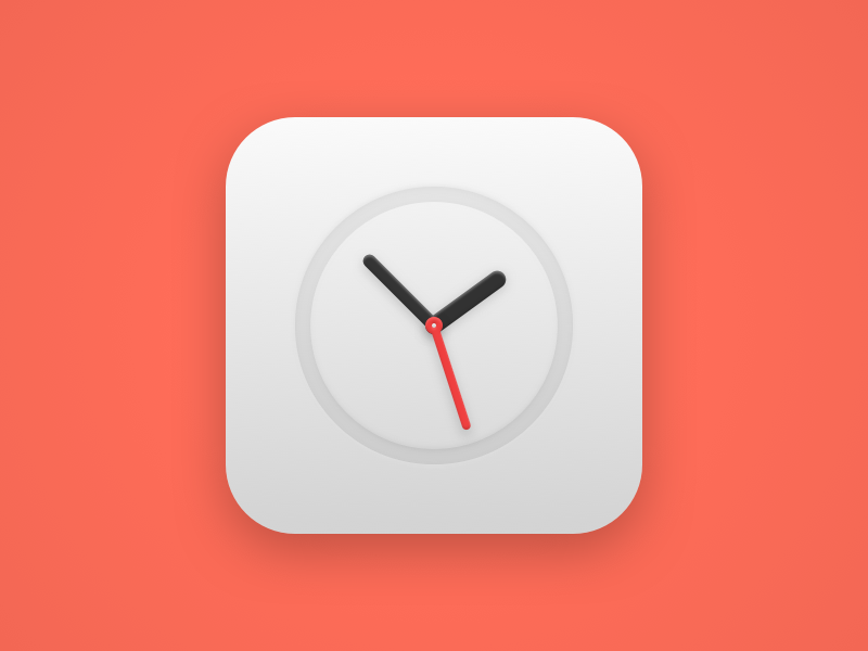
I brought back de visual I did in the Browser icon, doing a negative embossed ring, but this time, the hands stay inside the ring. I also tried doing a dark version of the icon, with white hands, but I liked this one better.
What do you...
This one was a bit different from the other icons on the set.
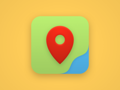
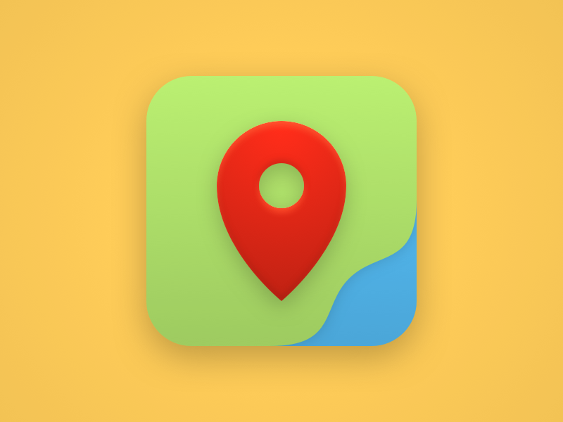
At first I thought a white background would be fine, but I didn't like it, so I ended up doing this terrain-like background, breaking the fixed-circle-space-in-the-middle guid...
This one was quite tricky to achieve.
First I made a CD, but it ended up being too realistic for what I wanted for the set.
Then I tried a play button, but wasn't still satisfied with the result.
At last I tried this note, and I guess i...