


Safe Helpline Website
4
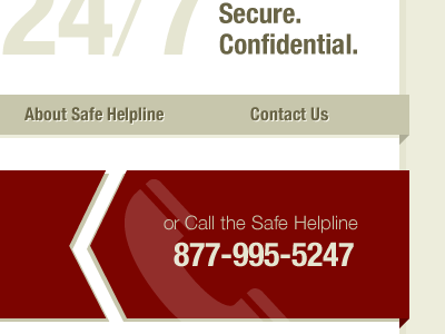
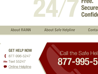
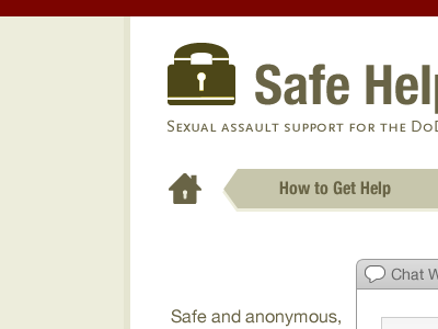
We worked with RAINN on creating a new website for their Safe Helpline service for the DoD.
More Projects


4
We worked with RAINN on creating a new website for their Safe Helpline service for the DoD.


