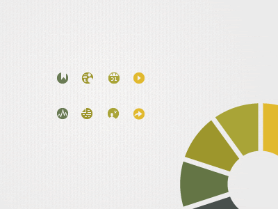
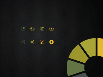
Another round of 16x16 pixel icons for the Litmus marketing site. Swapped the outlines for a more solid look and changed the icon for "Infographic" (though I'm not sold on this one either).
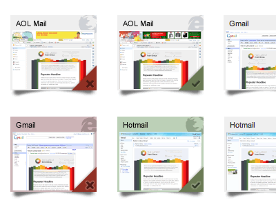
Working on improvements to the thumbnail view of email tests by showing more clearly which browser the screenshot was taken in and highlighting those that a user has marked good or bad (a feature we'd like to see more people using).
I've been working on some custom icons for the Litmus marketing site. As always, getting a point across in 16 x 16 pixels is a huge pain, and these probably aren't completely done yet, but they're close.
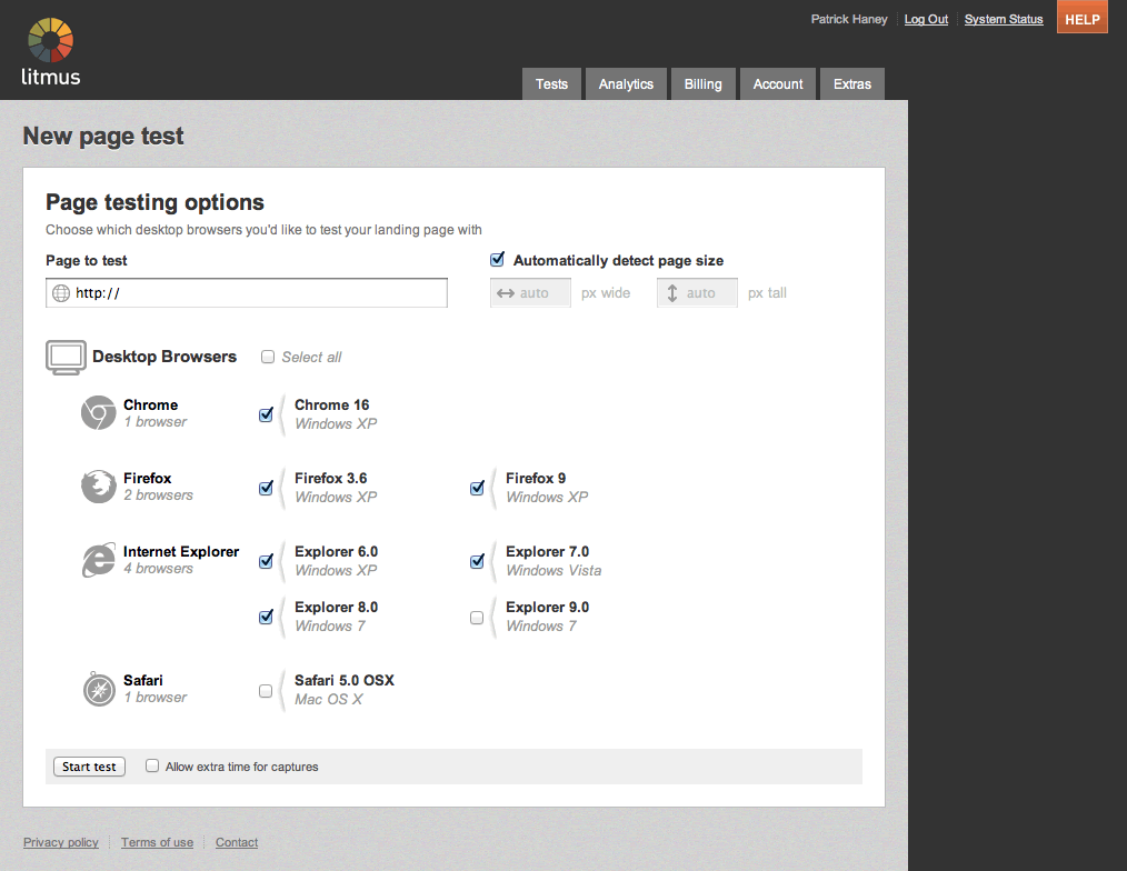
My latest UI rework of the Litmus application has gone live! The New Page Test screen is much easier to use and features my Flat Browser Icons. Available to all Litmus customers as of 10 minutes ago!
Check the attachment for the full pa...
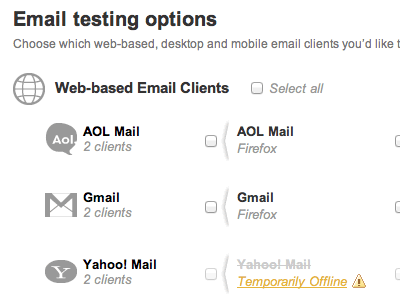
Sometimes a Litmus client test has to be taken offline due to a service interruption or something on our side, and our users get confused when we remove the option completely. So we're working on a way to show all of our clients but disa...
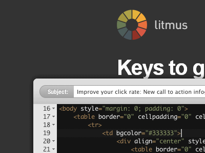
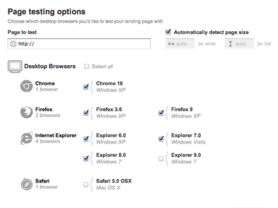
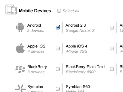
Working on redesigning the Litmus email tests selection form, figuring out how to organize the many different options to make it easier to scan and select those you care about.
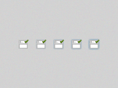
Part of my first task on a new project was creating this icon, and then producing a glow effect on rollover (with CSS transitions of course). Here's a sneak peek...