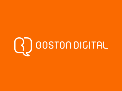
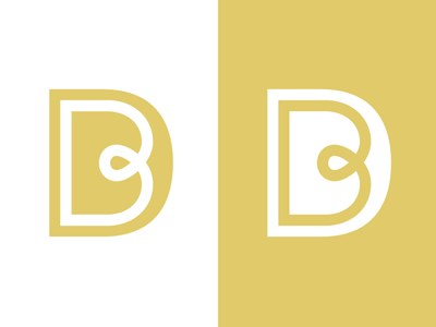
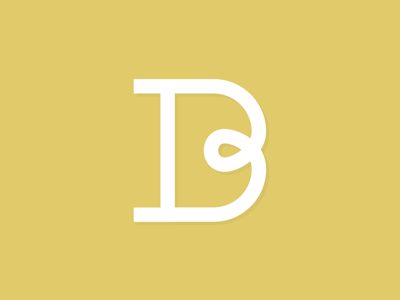
Just wrapped up the 'BD' project for a digital design firm in Boston, AU.
Not 100% sure they're sticking with the current color scheme > but it's the primary option for the moment... If we go ahead with a variation for the ID materia...
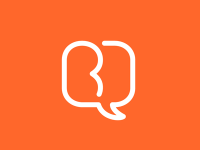
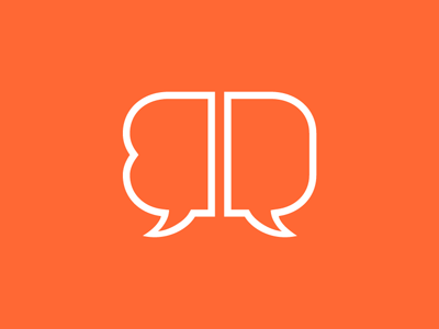
Gave a little more thought to the speech bubble play... At least now I've got the letters facing the right way round now ;)
**Tail flipped > HERE
*Plus one more option (not quite as distilled) > HERE
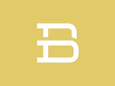
One of the totally different directions I've been thinking about for the 'B/D'. Started out with some speech bubbles and ended up with this guy...
*No company name just yet > but it's a rebrand for a new-media design outfit.
Trying to work out the fine line between a 'B/D'...
Haven't run across one quite like this before? But if any of you have > please don't hesitate to point it out ;)