Freelance Graphic Designer
insydo is moving away from ‘city guide’ and moving towards more regional content through storytelling and video. There will be more depth to the content and more real moments; there will be more content that entertains and inspires. As a brand, we still want the ‘cool’, ‘edgy’ factor, but we also want the logo to have an authority and represent the content quality.
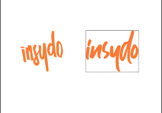
Attached is our current logo and we have also provided one template of something that feels like a “cleaner” version - Please note: we want to adapt our current version. The new version is only there as a reference for something that is more legible.
Please can you review the current logo and the stimulus for something that is simpler and cleaner to do the following:
- Make the letters a bit thinner and more recognisable - eg: The ‘S’ needs a more defined curve at the top.
- Make ‘insydo’ easy to read – with no letters being confusing.
- Make it more clear & legible.
- We still want the ‘cool’, ‘edgy’ factor, but we also want the logo to have an authority and represent the content quality.
- Straight lines, purposeful curves - NOT paint-brushy, like graffiti or like a sketch… Should look professional, but cool.
- Please provide options on white and black backgrounds.
Please see the links below to get a better understanding of our brand, our style and the different places we use our logo.


