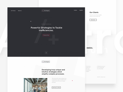
Here's a shot of one of the landing pages for the sub-brands working within A. Anthony Corp. We used subtle differences in each sub brand to allow the businesses to associate the differences with a different offering, yet retaining some ...
We've been working hard on designing a new platform ui for our good friends over at A.Anthony. It's been a busy few months for us, from designing and building a new marketing website to fully creating a new react storybook module linking...
Here's some brand signage showing the AAC logo mark in use, showing the connections with the real world components. The colour contrast and simplicity adds to the simplistic realisation of what is actually a complex corporation.
Think w...
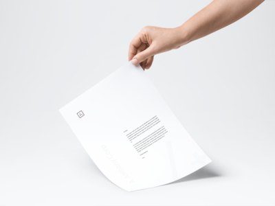
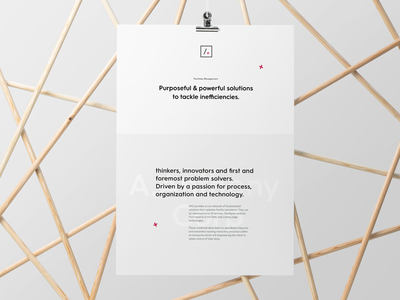
As part of the larger branding project for A. Anthony Corp, we've created some really nice stationary designs. We'll be sharing more of this project soon, really excited to share what we've done for the brand and marketing.
Like what we...
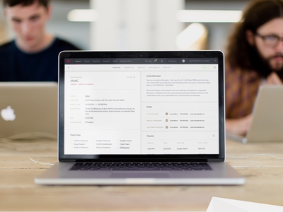
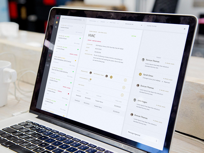
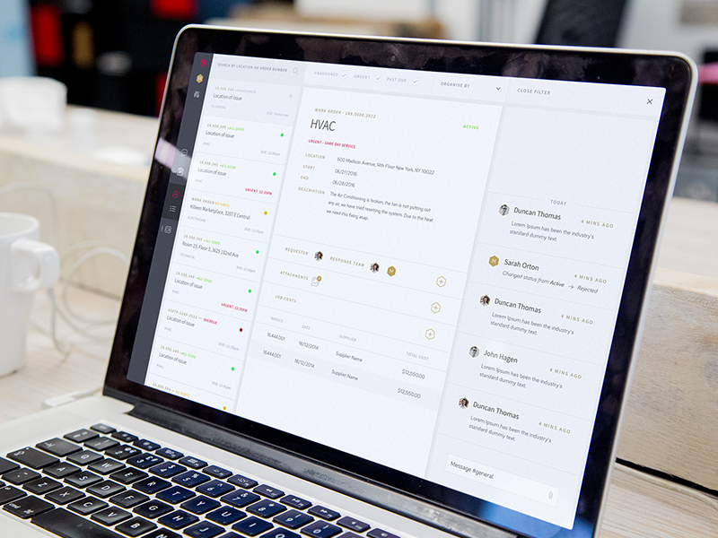
A glance at the Poly platform designed inline with the A Anthony Corp project. This powerful technology makes buildings and facility management simple, this echoed in the design of the user interface seen here.
If you like what we do an...
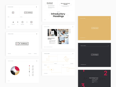
A look at the brand book for A. Anthony Corp. We developed a brand house which had variations of tone for each sub brand while tying back to the original corporate identity.
Like what we do? Why not reach out or check out our other work
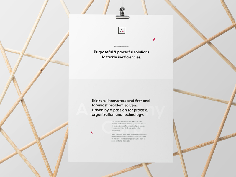
Another shot of the A. Anthony Corp brand. Here showing the messaging to inspire and distill the most complex elements to their simplest form.
We are always on the look out for our next collaboration. Say hi@gravita.co
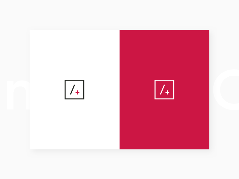
Final evolution for A. Anthony Corp previous incarnations we're too complicated so we simplified down to the base core.
A + You (Their Clients)
Sharing more of the narrative soon along with more platform stuff.