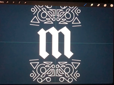
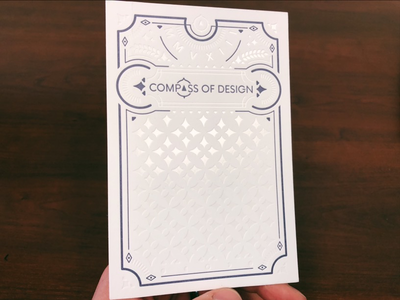
Here's a letterpress card that I worked on for Compass of Design. These were printed by a great company out of Louisiana called Rise and Shine who was a fabulous company to work with. If you're interested in the process behind the print...
This is part of a newsletter that went out for the Compass of Design Newsletter. I'm went over how to choose and use colors from a color palette in your ui design. This is a follow up to a recent guide we put out about Design Principle: ...
This is part of a newsletter that will go out tomorrow for the Compass of Design Newsletter. I'm going over how to choose and use colors from a color palette in your ui design. This is a follow up to a recent guide we put out about Desig...
Another shot of an illustration. This has a sister illustration which both will live on the new site for our design community site
I'll have a case study for this which will live on the So Magnetic page, but for now, I thought I would s...
I've been getting a few questions about why I'm building a new community platform for our Compass of Design group, and my main reason is that Design feedback is essentially broken.
Today I'll be talking about how to give and get better ...
Working on a new landing page for the Compass of Design Community.
We've got a lot of changes coming up for the community so if you want to stay in the loop on when we're opening the registration for next season, check out the current c...
I'm currently working on a better landing page for what we have over at Compass of Design for our community page.
The original design only updated a tiny bit at a time, but as we are working on a 2.0 of the community, the site should re...
This is one of the title cards that I've used in our recent post on heroes of UX Design
I've been working in the background on some UI designs for an upcoming project for the Compass of Design and our community there.
One of the thing...