


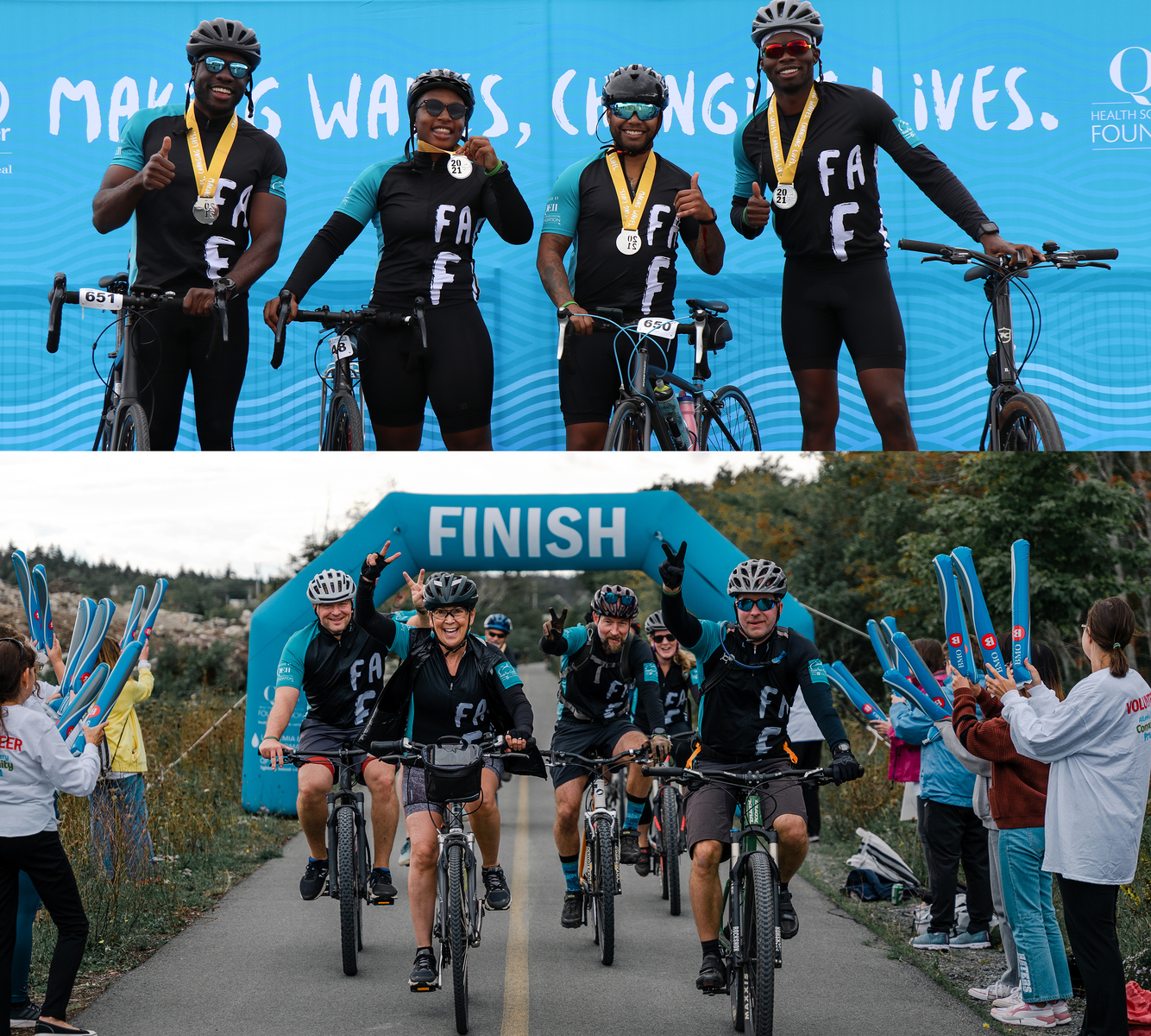
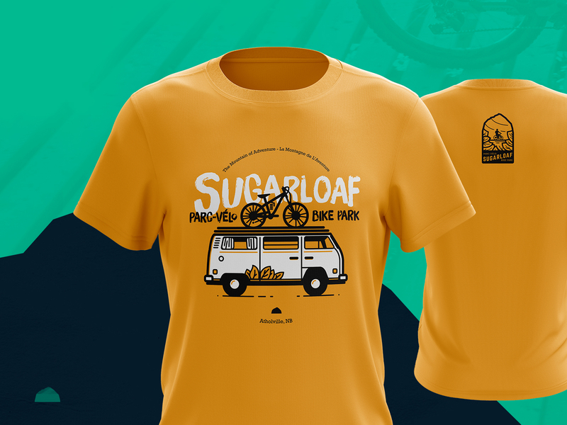
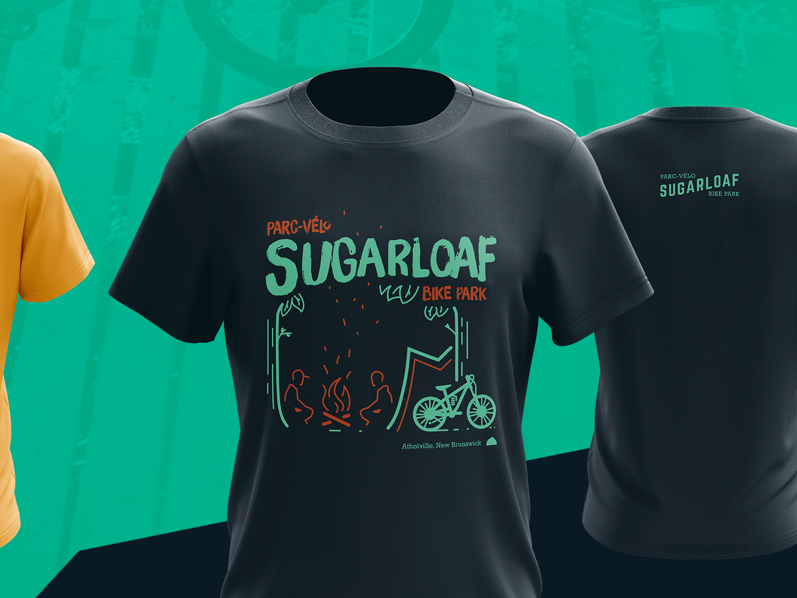
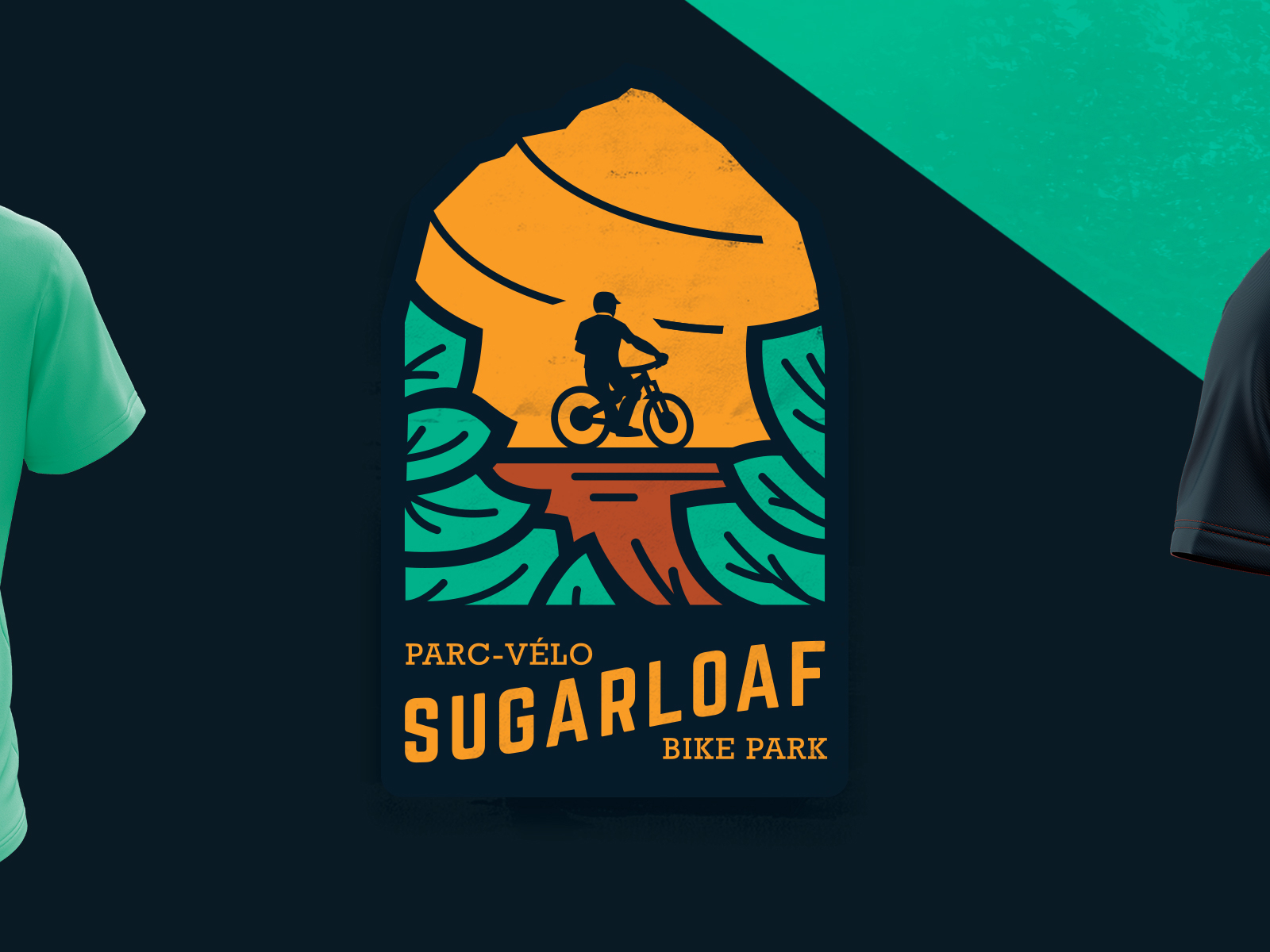
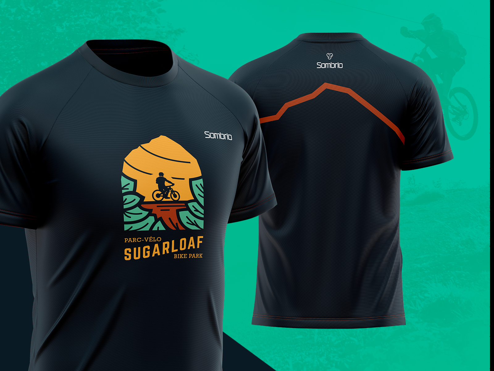
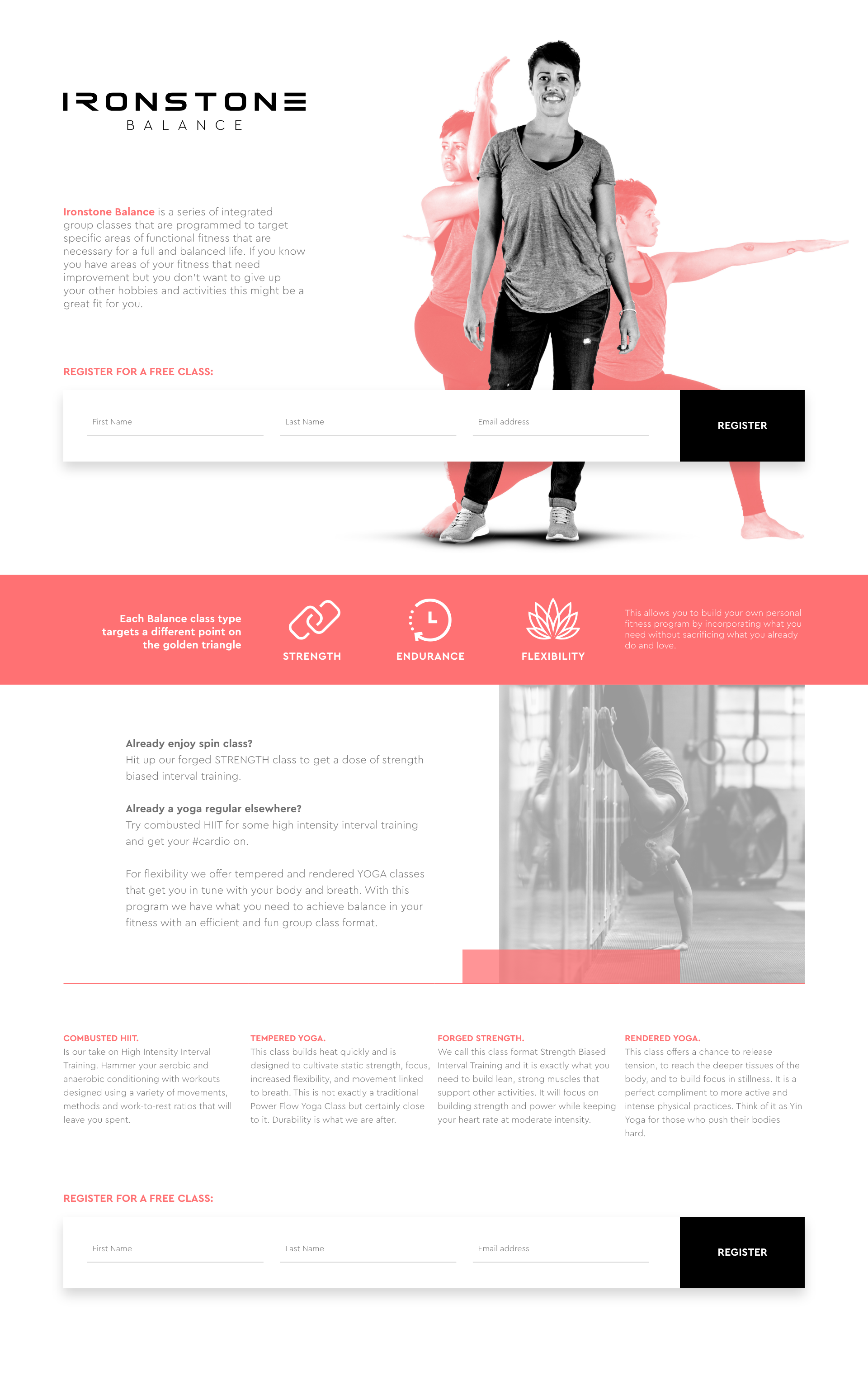
Sport Branding
22 • 7
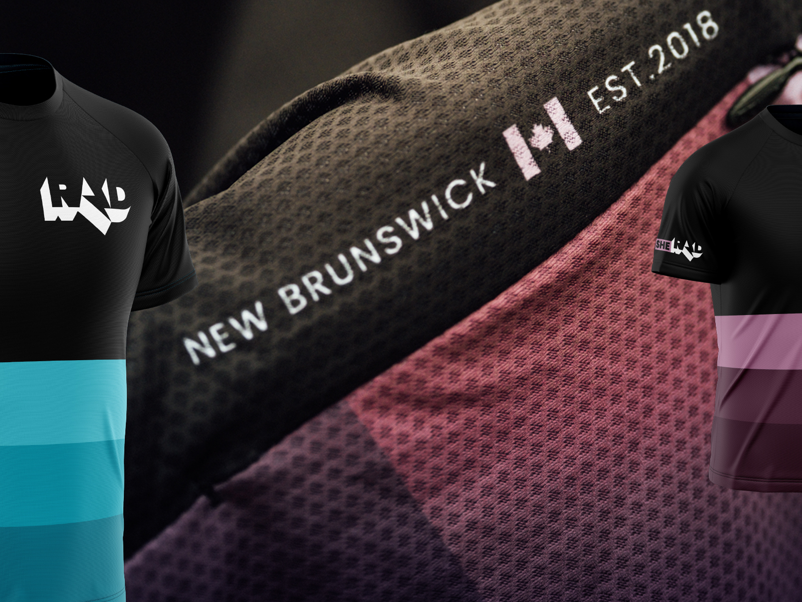
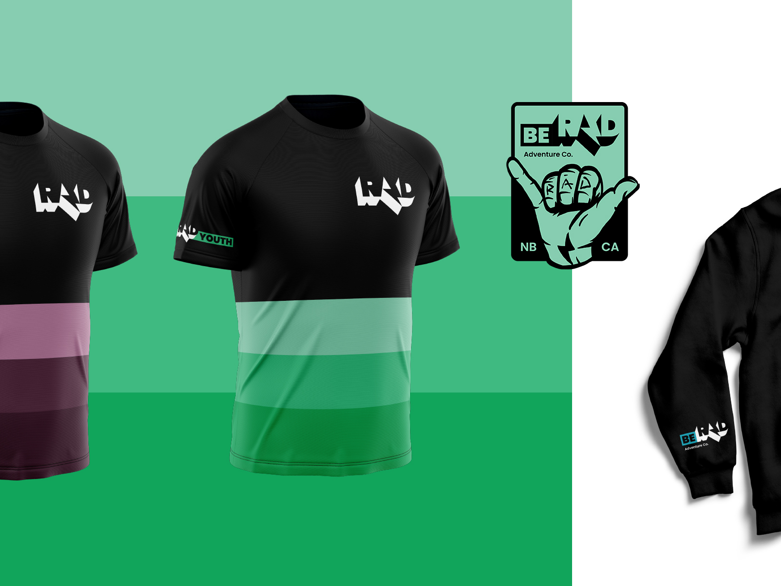
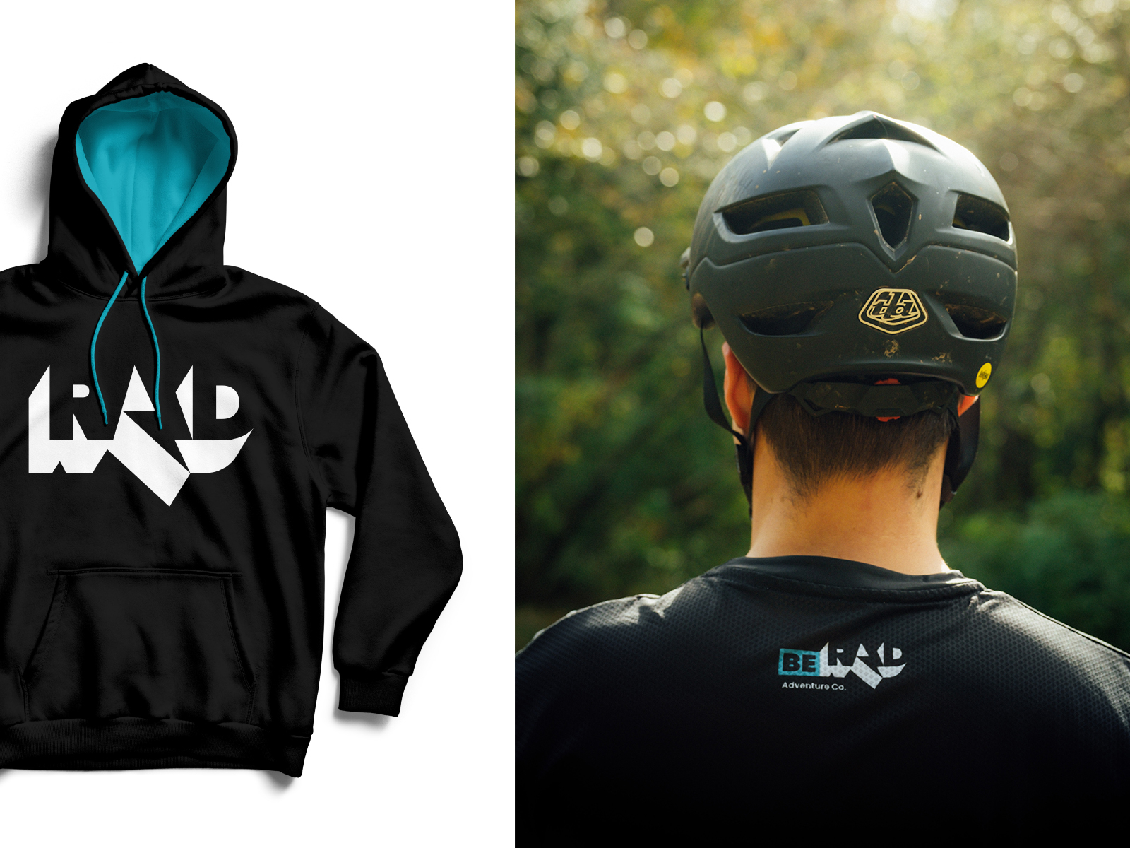
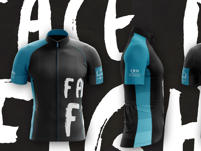
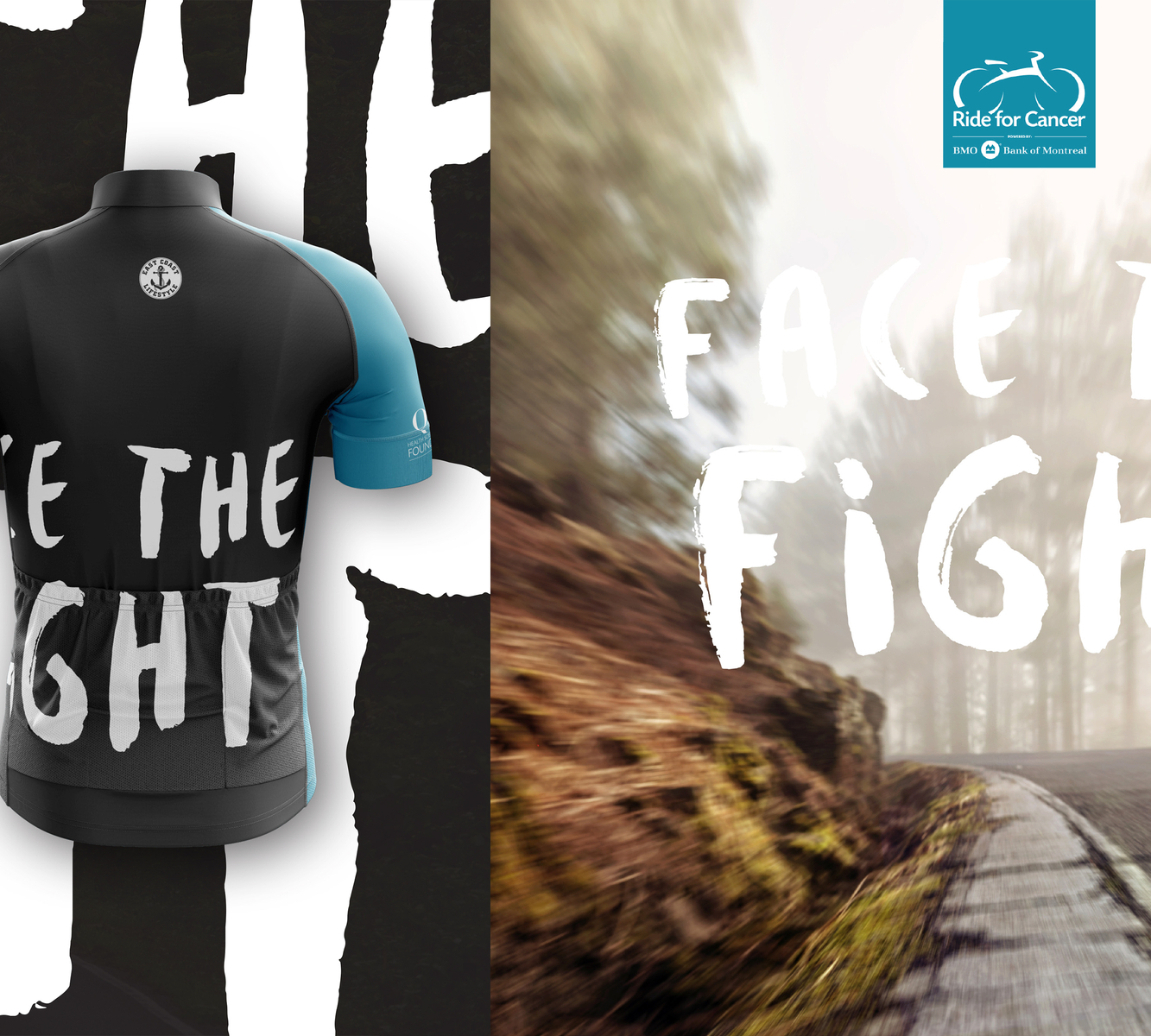
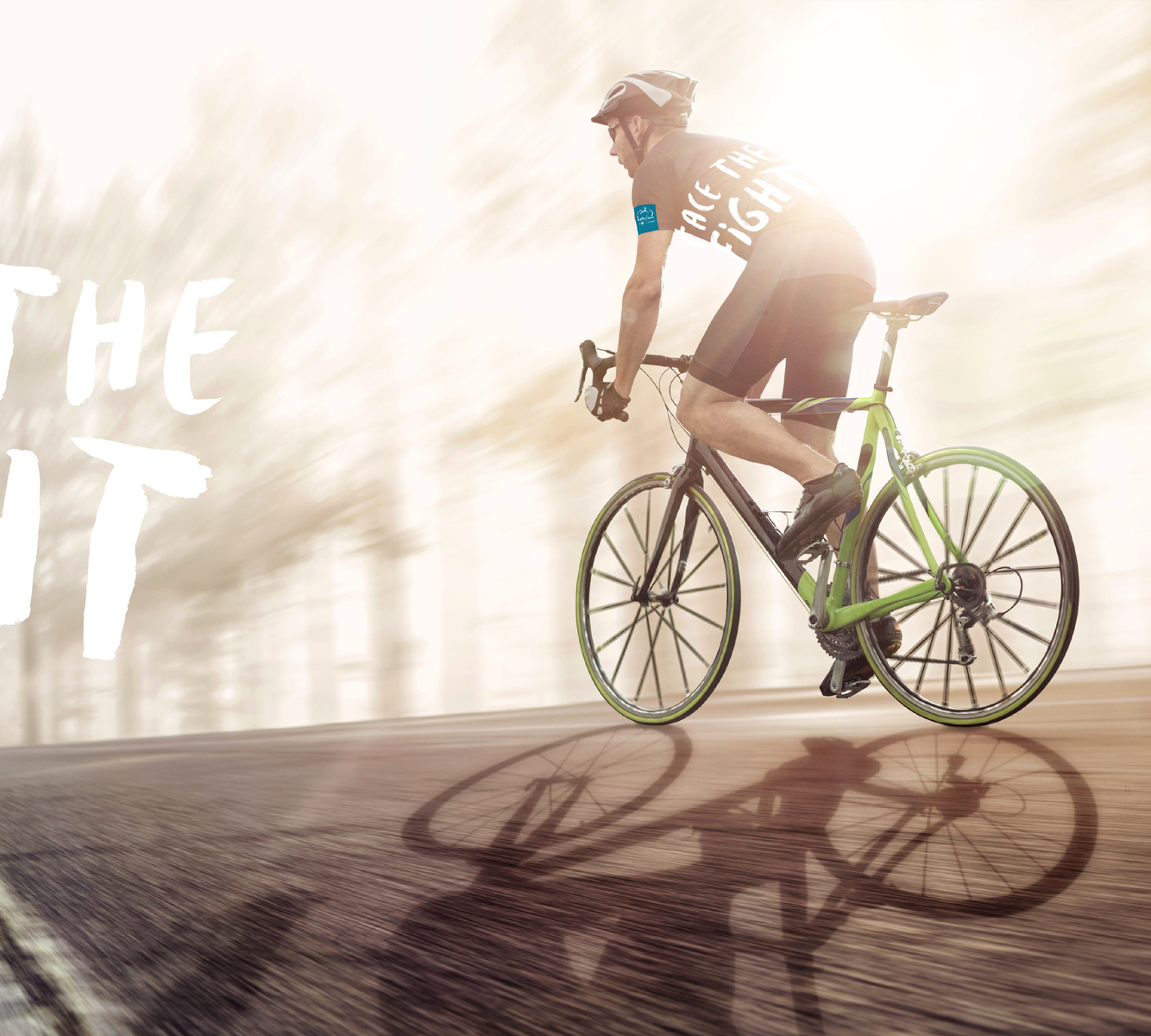
A variety of projects in the sporting world, everything from bikes to hockey.
More Projects


22 • 7
A variety of projects in the sporting world, everything from bikes to hockey.


