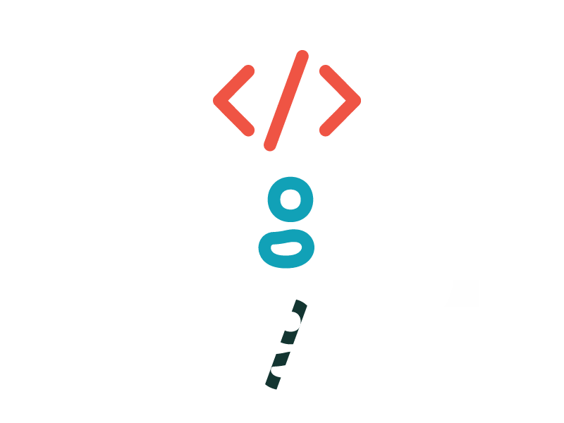
I think I'm liking where this logo design is going.
I think it communicates coding and design well.
I'm not sure if I can find a good way to do a single color version, I'll have to keep working on it.
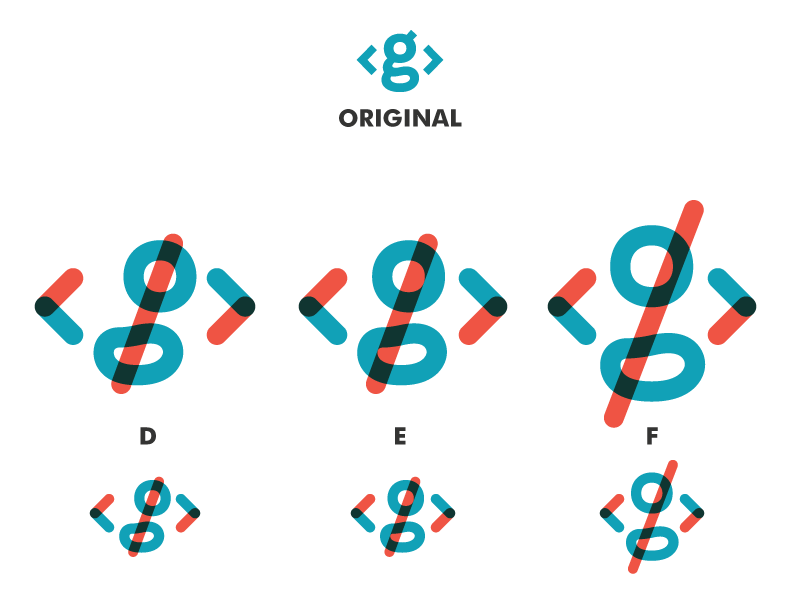
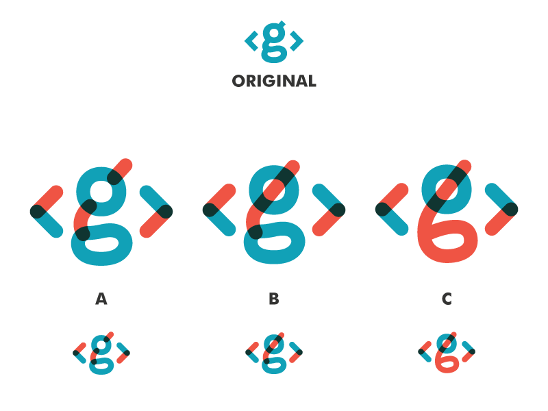
More variations of the overprint idea I've been kicking around in my brain.
Trying to make the slash connect the g circles and make it look like a self closing tag (html). I'm leaning towards e on this set.
Just an idea for a logo redesign I've been thinking about. It's one that seemed great in my head, but I'm a bit unsure of it now that I see it.
Also I realized that it bites Assembly's old homepage bg and Skillshare's logo, but that's ...
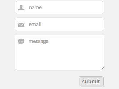
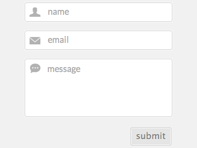
I updated it and moved the message up a bit. I also changed the way the sprites are handled so the form could be elastic vertically. The only visual indication that anything changed is the handle on the textarea.