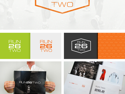
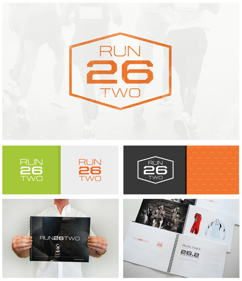
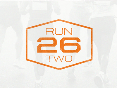
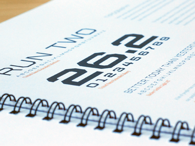
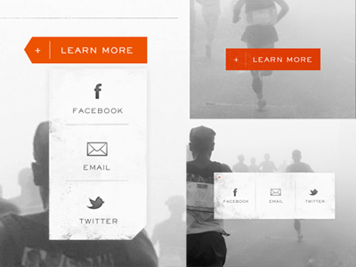
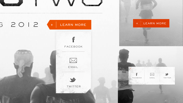
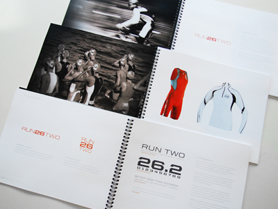
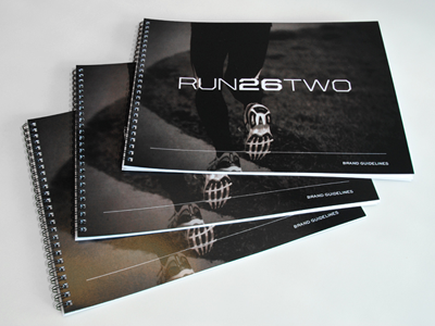
Here is a better snap at how part of the page will play out. See attachment...
We have a detailed article on this project if you want some context → http://focuslabllc.com/blog/branding-run26two
Creating headers for our new portfolio layouts. This is the badge for the running company we branded earlier this year.
Here is the process post incase you missed it → http://focuslabllc.com/blog/branding-run26two
Typography page in a new style guide we made to finish up a branding project. United Sans Extended is the main typography option you are looking at. It turned out to be a perfect selection for this branding project.
Read about it here &...
Here are the 3 elements as they evolved. I started with the simple square call to action with another square contact element appearing on rollover. After some text changes I had to reformat the layout a bit and ended up with the look on ...
Here is another peak at a new style guide we just completed for a recent branding project. Check out the full process and more great shots on our blog post > http://focuslabllc.com/blog/branding-run26two
This is a peek at a new branding project style guide. Full blog post with detailed shots coming this week :)
New blog post is up > http://focuslabllc.com/blog/branding-run26two
This is what appears when you rollover the call to action. The cropped corner looks weird in this shot but ties in with the angles on the logotype.
Check out the branding process here > http://focuslabllc.com/blog/branding-run26two