4 Shots
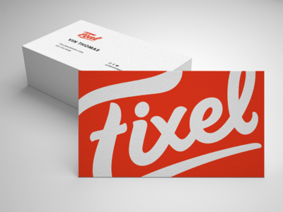
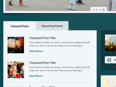
Working on a site design with the http://wearefixel.com/ team. We're also doing full branding and site development.
April 30, 2011
I think the contrast works a little better with square corners. Also changed from inset separators to dotted. I also played with the shadow a bit. Thoughts?
April 29, 2011
Working on the dropdown menu. Trying to get the contrast just right. This feels a little too light. Feedback welcome.
April 26, 2011
More from the BRB project.
A sneak peek at the home page elements for a new site from the http://wearefixel.com/ team.
Available for new projects