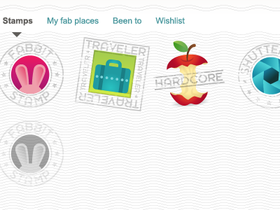
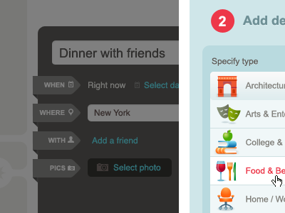
Fabulis (the old Fab)
34
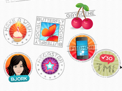
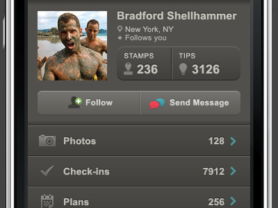
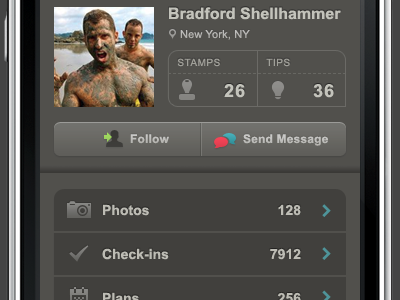
Designs from the previous Fab.com project, which initially started as Fabulis, but doesn't exist anymore.
More Projects


34
Designs from the previous Fab.com project, which initially started as Fabulis, but doesn't exist anymore.


