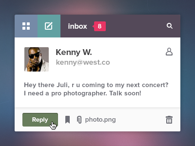
I was curious how would this widget look like in more "traditional" style. The main styles (flat ui) are set in stone for this project but still I gave it a try during the coffee evening time. Otherwise I wouldn't sleep very well.
I took every bit of feedback I receieved from you awesome dribbblers and what I got on email/PM so ♥ thanks all of you!
Played with colors a lil bit but left the main purple and ocean blue. I also applied this technique with orange button I developed for 23snaps iPhone app and I kinda like how it emphasizes the important action.
Do you think this concept has a chance to live anyway?
Consider it just a practice of inquisitive mind.
Update: I know some people don't like rebounds of their work, and it would be cool to have an indication of whether the shot can be rebounded, but as we don't have it yet, I'm writing here:
Please feel free to rebound my shot, Rebound Alert!
This doesn't look amazing.. The 'replay' button looks weird. Why are you using an inner (dark) shadow? It looks like the button is already pressed or something.
Also the alignment is off. The text 'Hey there.. photographer' is placed 5 px (or maybe 7 who knows) to far to the right. The human icon is placed 1 px to far to the right.
The white drop shadow of the text, and the icons is to hard.
The "human" icon on the right looks like it is floating in outer space when you are placing it over there.
The seperator on the right of the icon (top left) is to hard.
You are using to many different styles / effects. Inner shadow in the top bar. Inner Glow in the orange button. Dark drop shadow on the top icons. White drop shadow in the bottom icons. (Can you press (click) these bottom icons? It looks like they are in an "off" state right now. Because you have used a white drop shadow.
@Bart Ebbekink You put some time to write this comment, so I'll reply.
First it's "reply" not "replay". Next, no idea what about the inner shadow on the button looks weird to you, it's quite common practice even for non-pressed button states. I'm too lazy to find examples but I'm sure there are.
I intentionally added some additional spacing to the text, I thought it was obvious.
I like the amount of shadow I put on the text, it makes it more crisp. And obviously everyone else too.
I don't see "many different styles" at all, dunno where you found it.
And it's really funny you find icons with white shadow applied "unclickable" :)
Anywhay thanks for putting time to write the feedback.
34 Responses (page 1 of 2)
Pro
Julia Khusainova
I was curious how would this widget look like in more "traditional" style. The main styles (flat ui) are set in stone for this project but still I gave it a try during the coffee evening time. Otherwise I wouldn't sleep very well.
I took every bit of feedback I receieved from you awesome dribbblers and what I got on email/PM so ♥ thanks all of you!
Played with colors a lil bit but left the main purple and ocean blue. I also applied this technique with orange button I developed for 23snaps iPhone app and I kinda like how it emphasizes the important action.
✔ Alternative Compose button here
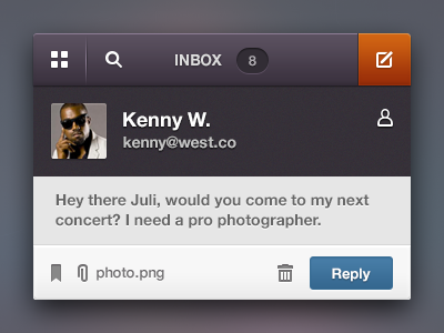
✔ All dark version here
✔ Retina version here
Do you think this concept has a chance to live anyway?
Consider it just a practice of inquisitive mind.
Update: I know some people don't like rebounds of their work, and it would be cool to have an indication of whether the shot can be rebounded, but as we don't have it yet, I'm writing here:
Please feel free to rebound my shot, Rebound Alert!
***
Thanks again you all rock,
@julia
about 1 month ago
Pro
Ionut Zamfir
@Julia Khusainova "All dark" version looks awesome! Great job :)
about 1 month ago
Pro
Aaron Sananes
Once again Julia, great work!
about 1 month ago
Pro
Ricardo Salazar
I like this design style too.
But I prefer this layout, as all looks better organized.
about 1 month ago
Pro
Julia Khusainova
@Ionut, @Aaron, @Ricardo Thank you guys!!
about 1 month ago
Pro
Rovane Durso
really nice! it looks so well polished :)
about 1 month ago
Pro
Deepak Jose
Love the colors. Nice job!!
about 1 month ago
Pro
ADIDAG
Awesome color palette
about 1 month ago
Pro
Kartik Mahant
Cool. Rebounds ?
about 1 month ago
Pro
Julia Khusainova
@Rovane, @Deepak, @ADIDAG Cheers friends! :)
@Kartik REBOUND ALERT!
about 1 month ago
Pro
Andrew Lucas
I way prefer this version!
about 1 month ago
Pro
Eelco Guntlisbergen
+1 for the colors. Very original.
about 1 month ago
Pro
Avinash Tripathi
this is so cool!
about 1 month ago
Pro
Zaib Ali
Sexy shot!
about 1 month ago
Pro
krishnachaitanya
awesome! looks great :)
about 1 month ago
Pro
Luboš Volkov
That color theme is incredible, and thank you for that fact its not flat! :)
about 1 month ago
Pro
Rodrigo Grundig
I like the all black one :) and god, it's good to see some non-flat ui for a change.
about 1 month ago
Pro
Bluroon
awesome! love the icons and color combos, may I know where did you get the icon pack? :)
about 1 month ago
Pro
Davey Heuser
The reply button doesn't really fit the style of the top bar which looks amazing!
about 1 month ago
Pro
Dmitriy Chuta
Awesome. Nice colors
about 1 month ago
Pro
Tobia Crivellari
Well done! ;-)
about 1 month ago
Pro
Bart Ebbekink
This doesn't look amazing.. The 'replay' button looks weird. Why are you using an inner (dark) shadow? It looks like the button is already pressed or something.
Also the alignment is off. The text 'Hey there.. photographer' is placed 5 px (or maybe 7 who knows) to far to the right. The human icon is placed 1 px to far to the right.
The white drop shadow of the text, and the icons is to hard.
The "human" icon on the right looks like it is floating in outer space when you are placing it over there.
The seperator on the right of the icon (top left) is to hard.
You are using to many different styles / effects. Inner shadow in the top bar. Inner Glow in the orange button. Dark drop shadow on the top icons. White drop shadow in the bottom icons. (Can you press (click) these bottom icons? It looks like they are in an "off" state right now. Because you have used a white drop shadow.
See here.
http://cl.ly/image/1V2Z3m020k0K
This looks amazing though: http://alturl.com/adhyd
about 1 month ago
Rebound
Email from Johnny Blaze
by danielle cg
Some free time at work today. Decided to rebound @Julia Khusainova's shot.
Live: http://daniellecg.com/tests/inboxwidget/
about 1 month ago
Pro
matt rossi
might want to make the user thumbnail a little better quality, the retina version is very blurry.
about 1 month ago
Pro
Julia Khusainova
@Luboš, @Rodrigo Haha, thanks guys! I hear you :)
@Davey Thanks Davey! Which exactly doesn't fit?
@Bart Ebbekink You put some time to write this comment, so I'll reply.
First it's "reply" not "replay". Next, no idea what about the inner shadow on the button looks weird to you, it's quite common practice even for non-pressed button states. I'm too lazy to find examples but I'm sure there are.
UPDATE: Is Tim Van Damm an authority for you? Well Instagram does that
I intentionally added some additional spacing to the text, I thought it was obvious.
I like the amount of shadow I put on the text, it makes it more crisp. And obviously everyone else too.
I don't see "many different styles" at all, dunno where you found it.
And it's really funny you find icons with white shadow applied "unclickable" :)
Anywhay thanks for putting time to write the feedback.
@matt Thanks for noticing, will do.
Thanks everyone! Appreciate your time!
about 1 month ago