Triangle Toggle Concept

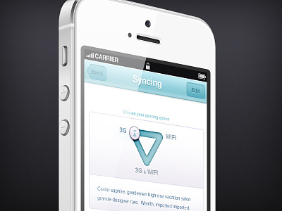
Some time ago we were struggling with the issue of offering an iOS app's users the option to choose between '3g', 'wifi' and '3g & wifi' syncing. This crossed our minds and although we didn't go with this we wanted to try it out in a design. The UI is purely fictional (made for fun for this shot). What do you guys think? We kinda like it, even though it takes in quite some space compared to a 'normal' toggle.
Triangle toggle vs. horizontal three-point-toggle
Having three options in a row is another great option. The advantage of the triangle one over a horizontal three-point toggle could be being able to switch between all three of them with equal ease. A horizontal three-point toggle in which the knob has to pass a middle station kind of implies the middle option is a condition for the absolute right option to be enabled. This is especially nice if the three options aren't superlatives of one another or don't imply a conditional relation (like 'cold' 'luke warm' 'warm'). This is merely an example, it could probably be applied in other cases (using 3 different options) as well or even better.
Please check out the animation (mp4)http://cloud.yummygum.com/1K3t1c2d2d1H/triangle%20toggle%20concept%20animation.mp4
iPhone by Pixeden.com


