Find designers
Designer search
Quickly find your next designer
Post a job
The #1 job board for design talent
Inspiration
Courses
UX Diploma
Learn UX design from scratch in 6 months
UI Certificate
12-week UI skill building for designers
Live interactive workshops
with design professionals
Jobs
Go Pro
Log in
Dribbble: the community for graphic design
Advance your career with a Professional Diploma in UX Design
Learn more
Log in
Sign up
Sidebar
James
Available for work
Follow
Following
Like
Get in touch
#535E65
#070505
#EDF1F2
#798383
#474443
#ADB8BC
#48362F
#8F7161
Download color palette
2x
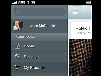
design
icons
iconset
iphone 5
retina
rogie
rogie king
ui
ux
View all tags
Posted on Mar 20, 2013
3,444
3
100
8
View feedback
James
Designer at Wireframe Design Studio
Get in touch
More by James
View profile
Previous
Next
Loading…
Loading…
Loading…