Find designers
Designer search
Quickly find your next designer
Post a job
The #1 job board for design talent
Inspiration
Courses
UX Diploma
Learn UX design from scratch in 6 months
UI Certificate
12-week UI skill building for designers
Live interactive workshops
with design professionals
Jobs
Go Pro
Log in
Dribbble: the community for graphic design
Log in
Sign up
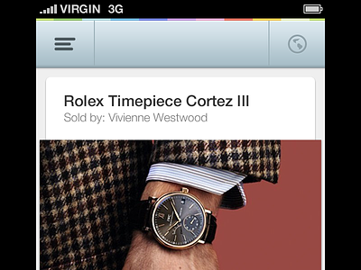
Header x2
James
Available for work
Follow
Following
Like
Get in touch
#0A0707
#EEF2F4
#B1BAC0
#984F48
#533B32
#645A57
#9F9282
#A15444
Download color palette
Check out @2x
design
icons
retina
ui
ux
x2
View all tags
Posted on Mar 18, 2013
2,372
11
90
15
View feedback
James
Designer at Wireframe Design Studio
Get in touch
More by James
View profile
Previous
Next
Loading…
Loading…
Loading…